Over the past months, we’ve added numerous enhancements to our Service overview pages. To maximize the value of these enhancements, it became necessary to build an entirely new page design. We’re now proud to present all the new views and features that the enhanced Service overview page design has to offer.
Service overview page
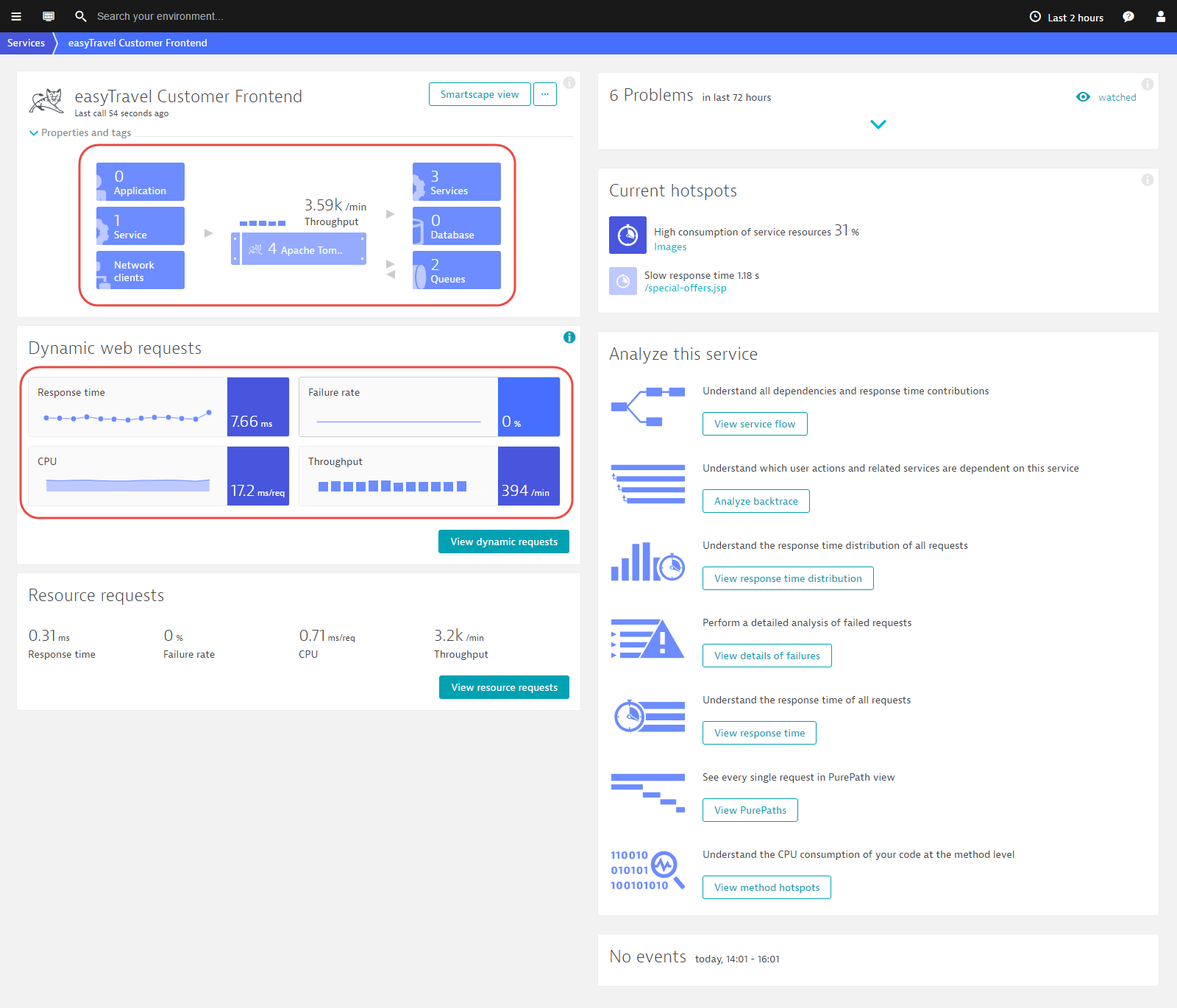
As you can see from the image below, the service overview page has received a major design overhaul. In addition to a redesigned service infographic and new features, the chart area has been reduced to several small trendline charts. In this way, more monitoring data is now visible at a glance, while the details are still accessible by clicking on the trend charts.

To view the new service overview page
- Select Transactions & services from the navigation menu.
- Select a service from the list.
Improved service infographic
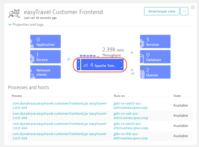
The new service infographic (see below) follows the same logic and includes the same high-level detail that was included in the previous design. Just click an infographic tile to view detail regarding caller and callee services, real user experience, and performance metrics for related services and databases.

The new infographic also provides information about the processes and hosts that a service runs on. Availability status and detail regarding recent calls is included for both Calling services and Processes and hosts.

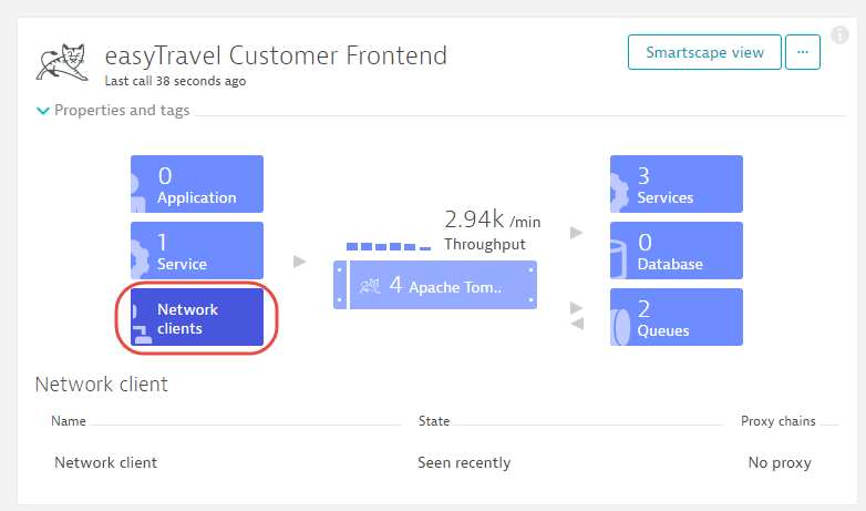
The service overview infographic now also explicitly states when a service receives traffic over the network that is not explicitly monitored by Dynatrace. The Network clients box (see below) appears when such traffic is detected.

Load balancer and proxy chains
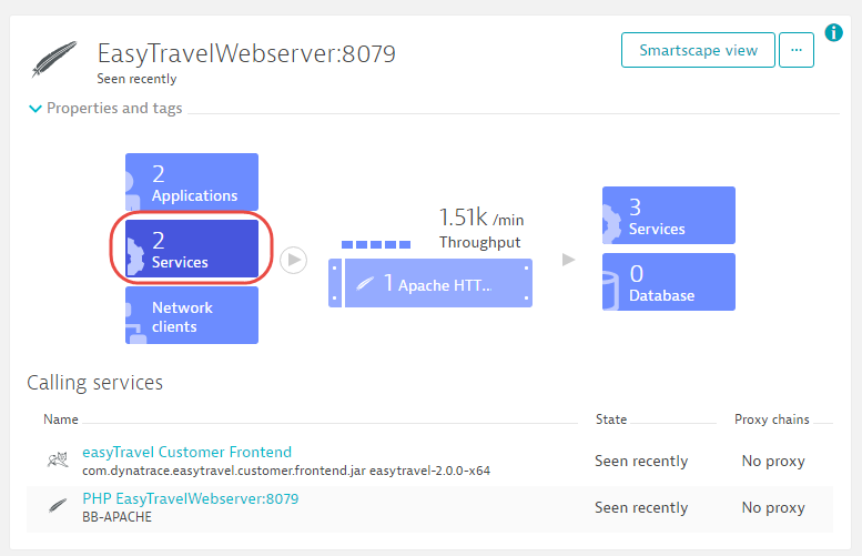
Another major enhancement on the newly designed service overview page is the inclusion of proxy and load balancer data. Just click the calling Applications tile or the Network clients tile to see information about related proxies and load balancers (see below).

Dynatrace detects proxies and load balancers that exist between services—for example, when a web server directs traffic to your application server, but a load balancer operates in front of the web server (as is the case with Amazon Elastic Load Balancer). Dynatrace detects and monitors each of these components and even resolves the processes that perform the load balancing!
This is not only useful for understanding the topology and dependencies in your environment. In an upcoming release, this monitoring functionality will enable Dynatrace to understand when availability or performance issues in your load balancer impact your environment. Stay tuned for this enhancement.
Trend charts
The new chart section is smaller. It includes trendline charts that turn red when a problem is detected. To view further details, click a trendline chart, or click the View dynamic requests button to access the new service Details page.

Service details page
The service Details page has also been vastly improved and provides much more information (see below). Each of the metric tabs now provides much more detail.
Most significantly, we’ve increased the chart resolution across the entire product. This gives you deeper visibility into small spikes and performance variations. For each request, you can now also view the Slowest 5% (95th percentile), a Failure rate chart, HTTP errors chart, and a CPU consumption chart. Clicking in the chart will show a vertical line and the numbers in the tables below will change accordingly; they will always reflect that line.

Improved service-instance support
If you run multiple instances of the same service across separate hosts, you’ll see a funnel view in the Server response time chart (see below). This funnel represents the worst and best of your instances at each point in time. If you see spikes in the funnel, but not in the overall response time, only a minority of the instances (or even a single instance) has experienced a response-time spike. When this is the case, you should take a deeper look at the breakdown of the specific service instance that’s experiencing the issue.
Notice how the top chart in the example below shows a spike in the funnel at 16:10, but not in the overall median response time? When you click the chart at that position and look at the instance break down, you see that one of the instances is much slower than the others. Click this instance to view more detail about this specific instance.

Client-side response time
Interestingly, many services reveal a totally new perspective in the Server response time chart when viewed from the client side. The example below shows response time and failure rate as perceived by the calling process on the client side.

Much more…
You also have access to all the standard analysis features that Dynatrace provides, in the context of the selected timeframe and metric. Also, notice that you can view all requests that were processed during a selected timeframe in the Top web request list. There is now a separate list here to make your key requests easier to find.


Looking for answers?
Start a new discussion or ask for help in our Q&A forum.
Go to forum