Part 2 of our power dashboarding series delves into how to leverage AI to make additional insights available at your fingertips. In this Dynatrace Dashboards tutorial, we'll also explore formatting options to enhance the aesthetics of your dashboards and guide the user's eye to the most relevant information. By the end, you'll have a visually appealing, AI-enhanced dashboard that delivers better, faster answers. Let's dive in and make your data shine!
Welcome back to our power dashboarding blog series, data enthusiasts! Today, our Dynatrace Dashboards tutorial will dive into some exciting features to level up our dashboards with little effort:
- Create charts effortlessly with Davis CoPilot™ using a natural language interface.
- Analyze your charts with AI to gain instant insights into trends and anomalies.
- Guide users with highlight formatting based on conditions, optimized visuals, and icons/emojis.
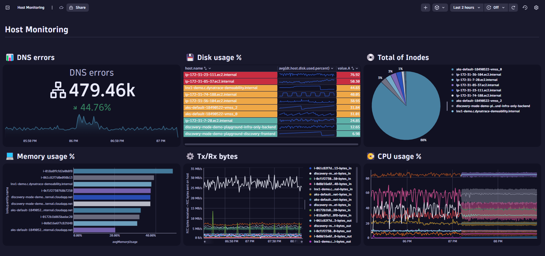
You can either continue with the custom infrastructure metrics dashboard you created in Part I or use the dashboard we prepared here (Dynatrace login required). By the end of this session, your enhanced dashboard will look like this:
Looking for something? Query your data with natural language
Davis CoPilot is an excellent virtual assistant that helps you create queries using natural language. While the Explore interface is useful for quickly visualizing known metrics, Davis CoPilot is great for exploring your data when you know your desired outcome but are unfamiliar with the available data. exploring your data when you know your desired outcome but are unfamiliar with the available data.
In our Dynatrace Dashboards tutorial, we want to add a chart that shows the bytes in and out per host over time to enhance visibility into network traffic. By tracking these metrics, we can identify any unusual spikes or drops in network activity, which might indicate performance issues or bottlenecks. To simplify the data and make it more readable, we’ll show only the entity names instead of the host IDs. This approach helps you quickly pinpoint potential problems and ensures efficient monitoring of your infrastructure.
Since we’re unsure which metric to use, we turn to CoPilot, using natural language to express what we’re looking for. For this tile, we’ll use the following prompt:
“Show me the bytes in and out by host over time, add the entity names for the hosts, and remove the host id.”
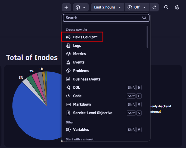
Create a chart with Davis CoPilot, visualizing bytes in/bytes out
- Select
+to create a Davis CoPilot tile. - In the options pane, select the Data tab and enter the natural language prompt above in the text field. Select Run.
- Go to the Visual tab and update the visualization to Categorical. The resulting tile displays the transmitted and received bytes, split by host. By default, dashboards show data from the last two hours. You can adjust the timeframe at any time using the selector located in the upper right corner of your dashboard.
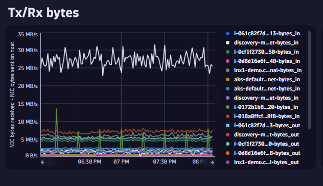
Figure 3. Add Transmit/Receive (Tx/Rx) bytes using Davis CoPilot.
That’s how easy querying your data and creating charts with Davis CoPilot can be. For more information on optimizing your prompts and best practices, check out the topic Tips for writing better prompts.
Now, let’s take our Dynatrace Dashboards tutorial a step further by using AI to analyze our charts and gain additional insights with the predictive capabilities of the Davis® AI Analyzer.
Upgrade your chart with an AI-powered trend forecast
In our dashboard, we already have a tile displaying CPU usage. Let’s enhance this chart with a trend outlook to gain insights into future CPU usage patterns. By monitoring and predicting CPU usage, we can ensure optimal performance, prevent potential bottlenecks, and proactively manage resources to maintain smooth system operations.
Add Davis® AI Analyzer to the CPU usage % chart
- Go to the Data tab and expand the Davis AI section at the bottom.
- Select the Activate Davis AI Analyzer toggle and select Forecast from the drop-down menu.
- Leave the default parameters and select Run.
- Go to the Visual tab and select the Davis AI Analysis category.
- Select the Chart option from the Davis AI Analysis category.

Figure 4. Add Forecasting powered by Davis® AI to a line chart.
You may have noticed the option to activate anomaly detection when adding forecasting. This feature provides immediate insights into unusual spikes or drops in your telemetry data. For more information, have a look at our recent blog post on utilizing Davis AI on dashboards.
Formatting Dynatrace Dashboards for enhanced usability and faster insights
By adding formatting to dashboards, you can improve usability, highlight important information, and make data easy to digest. Dashboards offer various ways to enhance data appearance, from simple color updates to conditional formatting based on rules.
To make it easy for users to quickly identify what’s important, format your charts to clearly display that information. We’ll now review and improve each dashboard tile to ensure it is user-friendly and easy to understand.
Access the customization options by going to the Visual tab of your selected tile.
Here, you can reassign data mapping, modify data representation, adjust the X/Y axis, change data colors, set thresholds, and assign units and formats to provide more context to your data. Depending on the selected visualization, you have various options for modifying the tile’s visuals.
Improve the DNS errors single-value tile
Let’s start by adjusting the visuals of the DNS errors tile. We want to make the information instantly clear to the user and modify the sparkline with ticks to better illustrate how the metric changes over time.
- Select the tile and go to the Visual tab.
- Expand the Single value section.
- Using the Show label option, update the label to DNS errors.
- Enable the Show icon option and select Network icon.
- Expand the Trend section. Update the arrow colors to red, blue, and green. Red indicates that the number of errors is increasing.
- Expand the Sparkline section. Set the Variant option to Area and enable Show ticks.

Figure 5. Improve visuals for the DNS errors single-value tile.
Improving the Inodes pie chart
For the pie chart displaying the total number of Inodes, we’ll adjust the colors to ensure consistency across the dashboard and minimize distractions. Blue will be used as the primary color to maintain a uniform palette. In other instances, it often also makes sense to use colors to indicate functional differences or common categories across different charts.
- Select the tile and go to the Visual tab.
- Select the Color section and expand it.
- Expand the Series colors option and select the Blue-steel category.
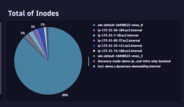
Figure 6. We improve the color palette of the pie chart.
Improving the Memory used % chart
To further reduce noise in our Dynatrace Dashboards tutorial, we’ll hide all displayed legends related to entity hostnames, retain only the essential fields, and update the color palette.
- Select the tile and go to the Visual tab.
- Select the Y-axis section, expand it and delete from the label to only leave entity.name.
- Go to the Legend and tooltip section and expand it.
- On the Displayed fields option, expand the list and uncheck
dt.entity.host field. - On the Show legend option, disable the toggle.
- Go to the Color section and expand it.
- In the Series colors option, select the list to expand it.
- Select the Blue-steel category.
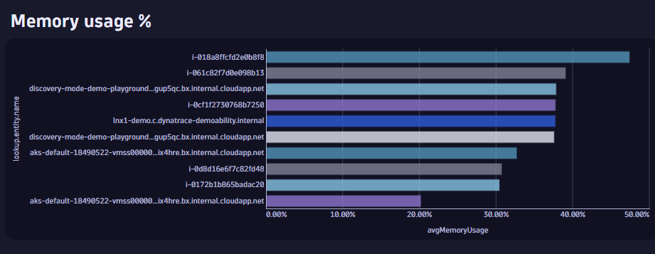
Figure 7. Optimize the labels and colors of the memory used % chart.
Use conditional formatting to highlight information in tables
Using conditional formatting in a table helps highlight important data points and trends, making it easier to spot anomalies and patterns at a glance. It also enhances readability by visually distinguishing between values based on predefined criteria.
Let’s enhance the visuals for the table displaying disk usage. We’ll hide some of the fields currently displayed and add a threshold for average disk usage by host using conditional formatting.
- Select the Columns section and expand it.
- On the Displayed fields option, select the list and uncheck the timeframe and interval fields.
- Go to the Cells section, expand it and change the Apply threshold color to option from Value to Background.
- Go to the Threshold section and select it.
- Select + Threshold. This will add a new threshold with three predetermined rules with empty values.
- On the Field option, select value.A.
- Change the three operators for the rules from ≥ to ≤.
- Modify each of the Value fields as displayed in the image below:
- Green: No action required.
- Yellow: Attention, potentially action required.
- Red: Warning, action required.
- Go back to the Cells section and enable the Show threshold in row option.
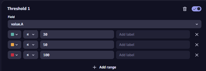
Figure 8. Add conditional formatting to the table to indicate levels of concern. 
Figure 9. Apply conditional formatting to a table.
Add icons and emojis in markup tiles
Including icons on your dashboard can enhance visual appeal and make it easier to quickly identify and interpret key information. Icons can also improve user experience by providing intuitive visual cues that guide users through the data. Dashboards support emojis and icons for that purpose, making it easier for users to identify the information they’re looking for quickly.
Add emojis/icons
- Select Windows key + . (period) on Windows or Fn + e on Mac in any markdown or text field.
- We’ll add a 🖥️ computer icon to the main title of our dashboard and incorporate more emojis in the subtitles. This will help users to faster navigate to the information they’re looking for.

Figure 10. Add icons to markdown tiles.
Dynatrace Dashboards tutorial: Where to go from here
With this Dynatrace Dashboard tutorial, you now have a solid understanding of dashboarding basics and are familiar with several customization options.
If you want to continue your learning journey, here are some recommended sources for further reading.
- Learn more about customizing visualizations: Discover various ways to tailor the visual elements to better suit your needs.
- Collaborate and share your dashboards: Enhance teamwork by sharing and working together on dashboards.
- Experiment with filtering by utilizing variables: Dive into using filters based on variables to refine and personalize your data views.


Looking for answers?
Start a new discussion or ask for help in our Q&A forum.
Go to forum