Enhanced data visualization options change how you present, analyze, and interact with your data in the Dynatrace Dashboards and Notebooks apps. We added honeycomb and histogram visualizations, made the visualizations more interactive, and introduced numerous custom settings, giving you all the tools you need to extract maximum value from your unified data.
Take your monitoring, data exploration, and storytelling to the next level with outstanding data visualization
All your applications and underlying infrastructure produce vast volumes of data that you need to monitor or analyze for insights. Visualizations help to curate data into a form that is more accessible to understand, highlighting trends and outliers, gaps, clusters, or patterns. At a single glance, visualizations can raise questions that stimulate further exploration or indicate problems.
Each type of visualization tells a different story and is best suited for a particular use case. If you want your data to speak to its audience, you need a comprehensive toolkit of visualizations and customization options. Good visualizations are not just static, unintelligent data presentations; they enable interaction and ideally serve as a starting point for subsequent analysis.
Dynatrace unified analytics capabilities for observability are top-of-the-class (Gartner Magic Quadrant 2024), enabling you to query and analyze all your observability data across your enterprise. The Dynatrace Notebooks and Dashboards apps are the perfect starting point for visualizing and understanding your data for monitoring or in-depth analysis.
Over the last year, we introduced many new functionalities and updated our visual presentation to provide you with an all-new experience:
- Optimized for exploring large data sets: We’ve optimized our entire interface, components, and visualizations to present large volumes of data while providing all the required flexibility.
- Visualize with a single click: Even inexperienced users can visualize data sets and create graphs in seconds.
- Broad range of visualizations: Our curated catalog provides numerous visualization types and hundreds of customization options, including the newly added honeycomb and histogram visualizations.
- Interact with your data: We integrated additional data interaction methods to provide more information immediately.
- Quick analysis with Davis CoPilot™: Explore your data through natural language by translating your conversational prompts directly into DQL queries.
Now, let’s introduce you to our two newest entries to our visualization catalog and tell you about the great things you can do with them.
New: identify hotspots with the honeycomb visualization
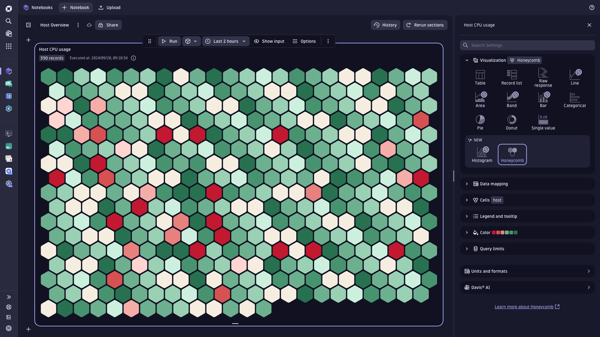
Honeycombs are great for visualizing health in complex and distributed systems, enabling you to visualize countless entities effectively and at scale. They have become a quasi-standard in the industry, especially for infrastructure monitoring visualizations.
The new honeycomb visualization in Dynatrace enhances your health dashboards and offers many customization options to tailor it to your needs. For example, it supports string and numerical values, enabling a multitude of different use cases. There are many practical applications of honeycombs; here is a small sample of just a few of them:
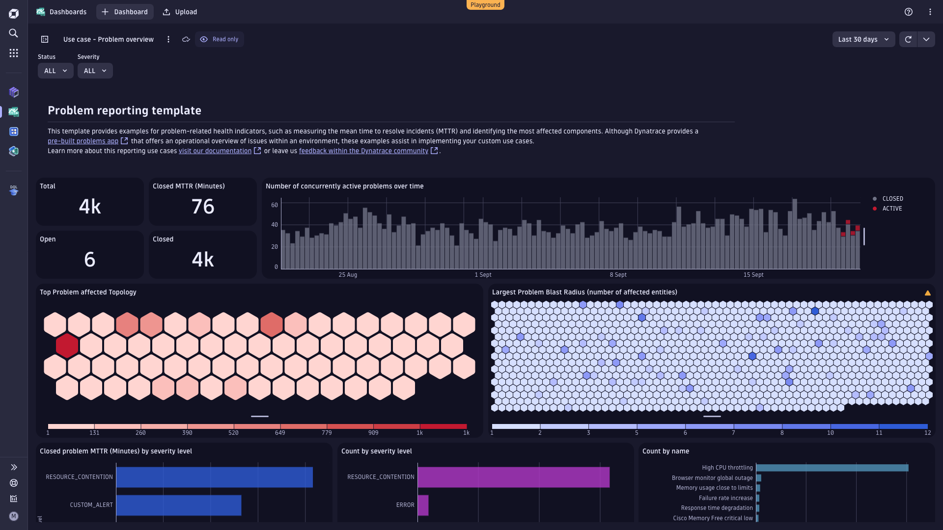
- Problem visualization: The new, ready-made dashboard for the Problems app features two honeycomb visualizations. At one glance, you see which entities are particularly affected by problems, and you can also identify the blast radius of a single problem to understand how many entities have been affected. Have a look at them on our Dynatrace Playground.
- Infrastructure health: A honeycomb chart is often used to visualize infrastructure health. You can use it to visualize CPU utilization across your hosts, disk space used, server-side response time, web request/service failure rates, or any other area where you need to spot outliers immediately.
- Service Level Objectives (SLO) tracking: Honeycomb charts can visualize SLOs, helping you monitor whether your services meet performance and reliability targets. Based on the color, you immediately see if any SLOs are off track. This can guide you in prioritizing issues that impact user experience.
How you get the best results with honeycombs
Honeycombs highlight hotspots that require attention. To achieve the best visual outcome, we recommend experimenting with the available customization options.
- Try different cell shapes. The honeycomb visualization also supports circles and square variants, allowing you to differentiate between use cases clearly.
- Use color coding to tell a story. Use different diverging and sequential color palettes to highlight patterns and insights in your data. The chart also supports conditional coloring for both string and numeric values.
- Min and max limits. Set an applicable, expected value range in the honeycomb visualization to ensure effective coloring and highlighting of hotspots and outliers. For example, set the value range for CPU consumption from 0% to 100%. In other use cases, you want to ensure a consistent zero-baseline (that is min = 0), but with an automatic scaling max value (max = auto).
Go to our documentation to learn more about implementing honeycomb visualizations on your dashboards or notebooks.
New: explore your data with histograms to identify patterns
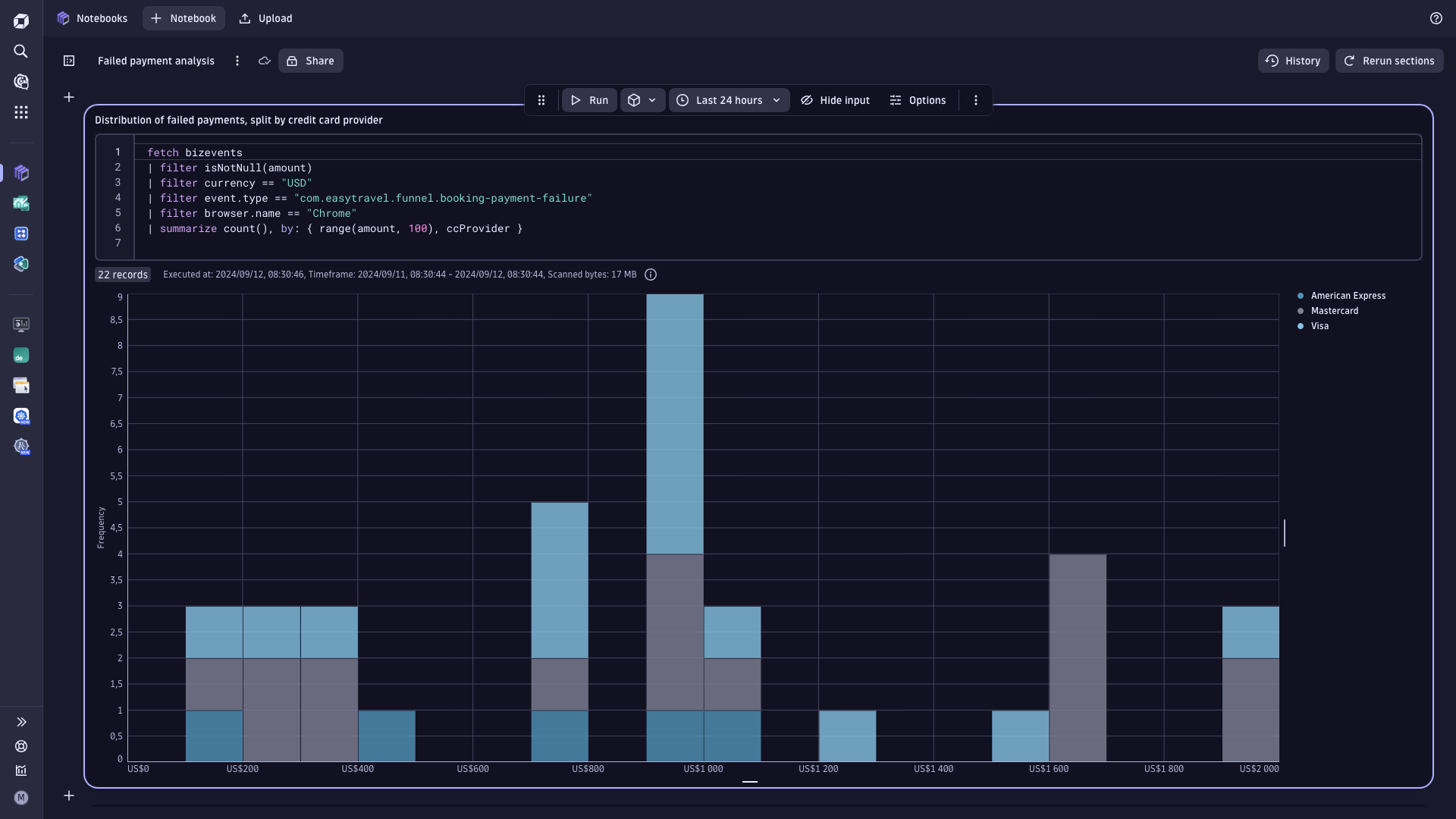
The histogram chart is a crucial visualization for understanding the distribution patterns of values within a given dataset. It shows where the peaks of the distribution are, whether the distribution is skewed or symmetric, and whether there are any outliers.
While histograms look much like time-series bar charts, they’re different in that each bar represents a count (often termed frequency) of metric values. These bars are called bins or buckets; their width represents a value range. The height of the bar reflects the frequency or count of data points within a bucket.
The use cases and underlying metrics analyzed via histograms are extremely broad:
- Latency distribution: Histograms can show the distribution of request latencies, helping you understand how many requests fall into different latency buckets. This is useful for identifying performance bottlenecks and understanding the overall user experience.
- Resource utilization: Use histograms to visualize the distribution of CPU or memory usage across different instances or containers. This helps identify outliers and understand the overall resource consumption patterns.
- Distributed tracing: Histograms can analyze the response times of different endpoints or services, allowing you to pinpoint which parts of your system are slower and need optimization.
- User behavior tracking: Track user interactions, such as login or page load times, to understand how users are experiencing your application. This can help identify areas for improvement in user experience.
How you get the best results with histogram charts
Experiment with bucket sizes. Use DQL’s built-in range function, together with the summarize command, to bucketize your data. The choice of bin size has an inverse relationship with the number of bins. The larger the bin sizes, the fewer bins will be needed to cover the whole range of data. With a smaller bin size, you’ll get more bins.
It is worth taking some time to test out different bin sizes to see how the distribution looks in each one, then choose the best plot that represents the data. Try out different range sizes or bin ranges (“widths”) with your data set – doing so can help you identify distinct patterns in the data.
If you have too many bins, the data distribution will look rough, making it difficult to discern the signal from the noise. On the other hand, with too few bins, the histogram will lack the details needed to discern any helpful patterns from the data. Identify common distribution patterns such as bimodal, comb, edge peak, normal, skewed, and uniform.
Add split by parameter. This can help compare sub-distributions; however, it is ideally limited to only two sub-divisions, such as A vs. B, North vs. South, Open vs. Closed, Male vs. Female, etc.
If you want to learn more about how to best use histograms for OTel observability, check out Mikko Viitanen’s OpenTelemetry histograms blog post. In this post, you’ll learn how to define and monitor service-level objectives with histograms that can be used to set up alerts.
After introducing the new visualizations, we will now look at our new custom settings.
Optimize your visualizations with many new configuration options
We elevated the handling of visualization settings across Dashboards and Notebooks in three powerful ways:
- We extended the customization options for all data visualizations by offering an additional 35+ configuration options, such as custom column types in the table, so you can better tailor your visualizations to your specific requirements.
- We improved the usability of all visualization settings by introducing new unified UI controls across both apps. Now, it’s even easier for users to customize visualizations as they see fit for any use case.
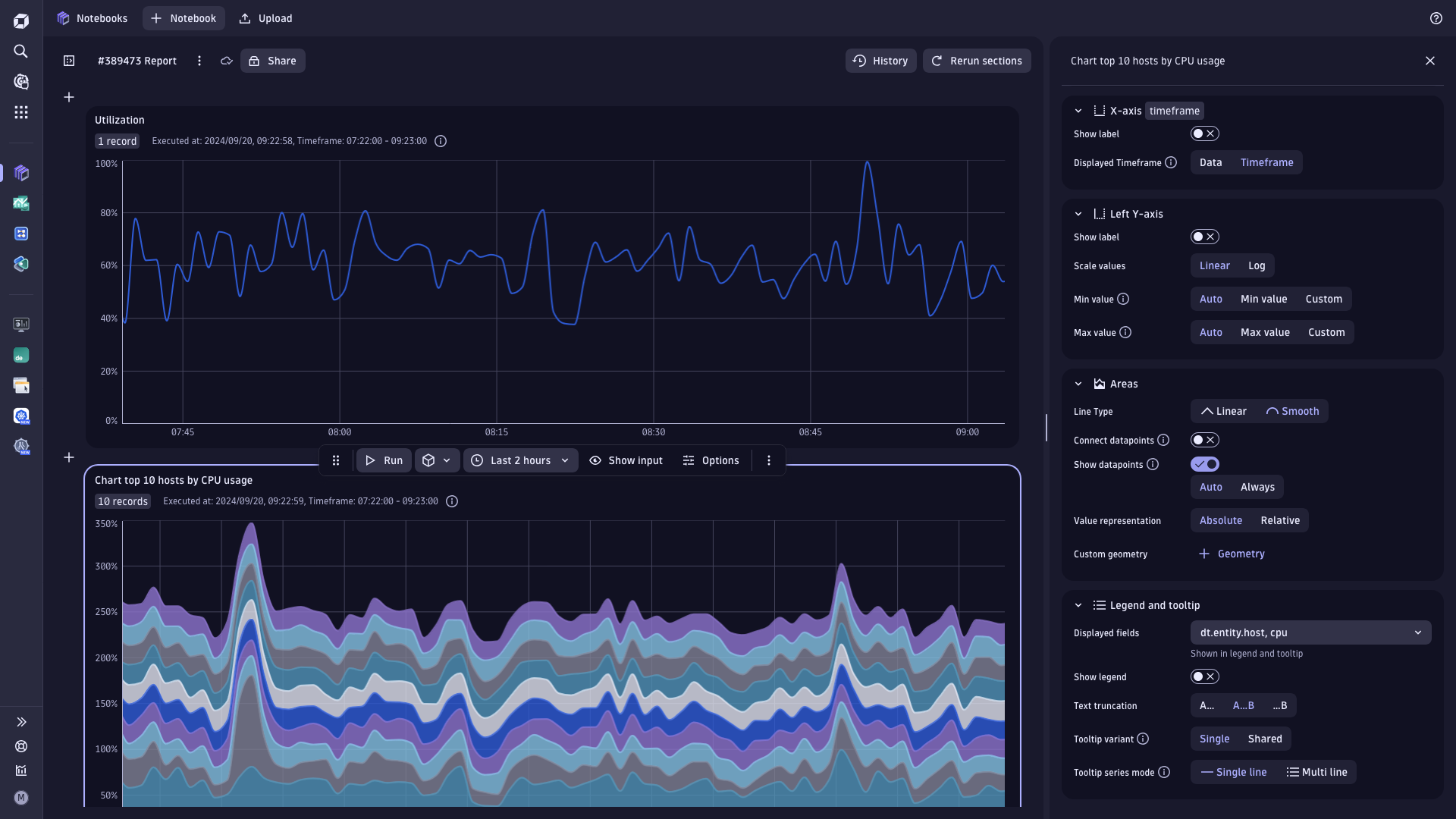
- We introduced a visualization settings search so that you can instantly search all settings and find the exact configuration or customization option you’re looking for.
Get more details immediately
In our recent release, we added more functionality to enable you to interact with your data. You can now zoom into your data or pan left and right in all time-series visualizations. This allows you to zoom in on a particular data set, see underlying details, or change the displayed data altogether. This allows you to dive deeper into your data anytime without needing to modify/rewrite your original query.
Taking this interaction a step further, in Dashboards, if you zoom in on one visualization, it will automatically apply to all other visualizations on the same dashboard.
The functionality is automatically available in all time-series charts in the Dashboards and Notebook apps.
Zoom-in
Click and drag any time series chart in your Dashboard or Notebook to zoom in on your data. The interaction will re-fetch data for the selected timeframe (in most cases, with a more fine-grained interval).
Alternatively, you can zoom in and out with the integrated chart toolbar, located in the top right corner of the chart, keyboard shortcuts, or touch gestures.
In Dashboards, the zoom interaction adapts the timeframe for the current chart and updates the entire dashboard, automatically synchronizing all other tiles and visualizations.

Figure 5. Zoom-in
Panning
You can click and drag the chart’s x-axis to pan it to the left or right while maintaining the current zoom level. Alternatively, you can pan left and right using the middle mouse button, activating the chart’s pan mode (via the integrated chart toolbar), keyboard shortcuts, or touch gestures.
Keyboard accessibility
If you prefer interacting with your visualizations via the keyboard, we also have you covered: all interactions are also available via the keyboard. Switch between modes with “e” to explore your data or “p” to pan the chart left and right. Holding down the “CMD/CTRL” key while pressing “arrow up” or “arrow down” will let you zoom in or out of the chart. Pressing “r” will quickly let you reset all the zoom and pan changes.
What’s next
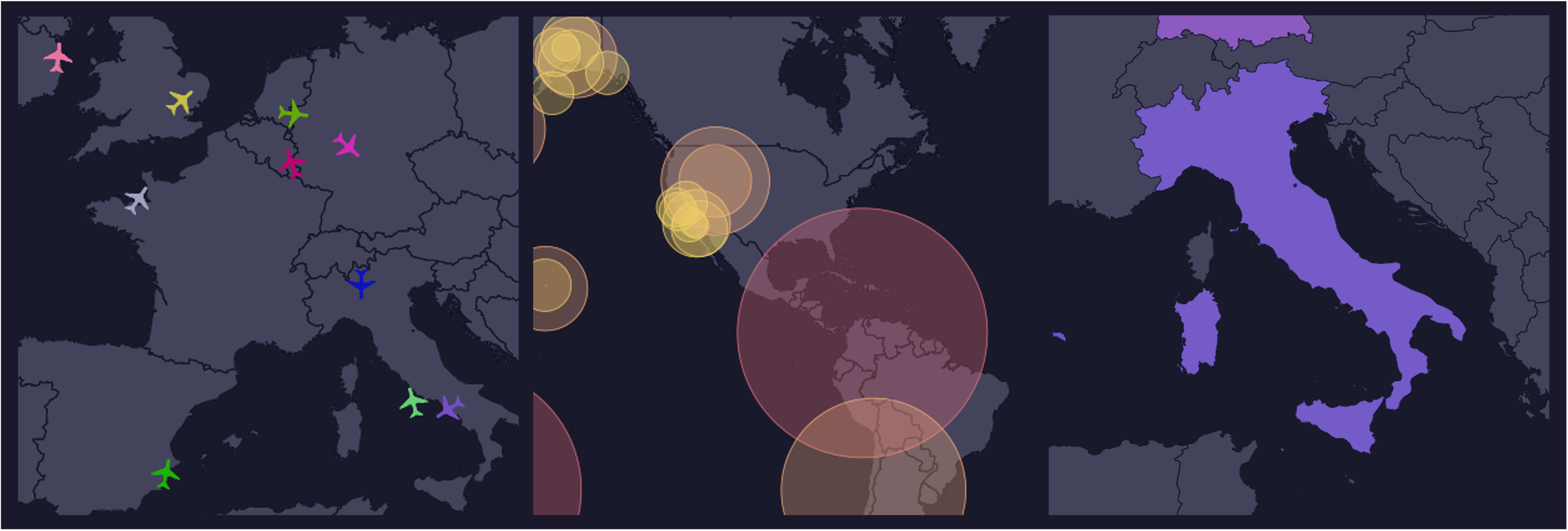
World map and heatmap visualization
We constantly exchange with our community and add further visualizations to our curated catalog where it makes sense. We’re currently working on introducing multiple world map visualizations and a heatmap, which you can expect to be released in the upcoming quarters.
Synchronized crosshair
In addition to the interactions described above, we will soon support automatically synchronizing all crosshairs across all time-series charts. That way, you can compare multiple charts more easily, regardless of the metric or time span.
Try our new visualizations now
If you’re an existing Dynatrace customer, visit your Dashboards app and check out our ready-made dashboards. Our new Getting Started document explains how to create and customize honeycomb and histogram visualizations. Also, have a look at our new Problems Dashboard, which you can access and download directly from the Dynatrace Playground.
To learn more about how data visualizations can enhance your app insights, check out our latest episode of Inside Dynatrace Apps with Mikele Hasson and Penny Scully


Looking for answers?
Start a new discussion or ask for help in our Q&A forum.
Go to forum