In this post, you'll see how integrated dashboards and our most recent additions to the Data explorer's configuration and visualization capabilities now better enable developers, DevOps engineers, and SREs to create, tailor, and use data visualizations to address their observability needs.
With digital systems growing exponentially in size and complexity, industry trends like AIOps and DevSecOps are becoming the norm for application performance monitoring (APM) and observability tools such as Dynatrace. As an industry leader, Dynatrace promotes primarily using software and AI to deal with this complexity at scale instead of just putting data on dashboards.
Does that mean that reactive and exploratory data analysis, often done manually and with the help of dashboards, are dead? No!

We believe that the two worlds of automated (AIOps) and manual (dashboards) data analytics are complementary rather than contradictory. The key lies in finding the best combination of these two worlds to yield the best insights and results. Not every situation lends itself to AIOps—for example, think about data that either can’t be monitored cost efficiently (where real-time processing wouldn’t benefit you) or when creating ad hoc reports to check long-term trends and make tactical/strategic business decisions in a timely fashion.
Of course, adequate solutions for both worlds exist, However, we argue that even today, they either lack the ease of use or smartness required by today’s complex cloud ecosystems.
Why today’s data analytics solutions still fail us
Data analytics solutions in the APM and observability space have matured steadily over the years. However, as with all software tools, more options that haven’t been integrated carefully usually lead to cluttered interfaces, making them complex and harder to use. And so, getting simple visualization use cases done efficiently becomes far from the norm.
When looking at the market, we see the following shortcomings of solutions:
- They’re good at visualization/dashboarding but not at automated analytics using AI engines.
- They don’t integrate these two worlds well but come as different, segregated tools.
- They’re easy to use but don’t provide automated and situational context.
- They aren’t enterprise ready and don’t scale well with your organization. For example, think about failings in permission management or in handling web-scale data.
- They become bloated and harder to learn and use.
Even tools that address most of these shortcomings don’t deliver because they usually require moderate to extensive manual configuration, not to mention all the maintenance efforts required whenever your systems change.
For example, in other solutions, to get details on each of your pods in a Kubernetes environment, you’d potentially end up creating a chain of dashboards to cover all the levels of your Kubernetes stack (clusters, nodes, pods, etc.).
Squaring the circle—Dynatrace offerings are smart and easy to use
Dynatrace dashboarding is a truly integrated and smart solution—it uses your environment’s topological information, providing, for example, out-of-the-box drill-downs directly from the visualizations to your system’s entities. There’s no need to create individual detail views for such entities because Dynatrace already has you covered, removing the burden of manual configuration.
A year ago, we introduced the Data explorer, the recommended tool for exploring and visualizing your metric data in Dynatrace. Since then, we’ve made several improvements to ease of use by providing:
- More context when selecting the data to be visualized and preconfigured visualization templates to get you started quickly.
- Extended configuration options for existing visualizations such as the abilities to control the format and coloring.
- Additional visualizations such as heatmaps and honeycombs to better visualize your environment’s states.
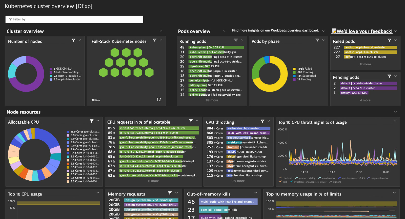
Read on below to see how these improvements helped us in practice to migrate and improve our preset Kubernetes dashboards, which come with Dynatrace out of the box.
Filter data
In previous versions of Dynatrace, users have been able to apply filters at the tile level or select from a predefined list of filters on dashboards. Our most recent additions for Data explorer tiles offer you even more flexibility!
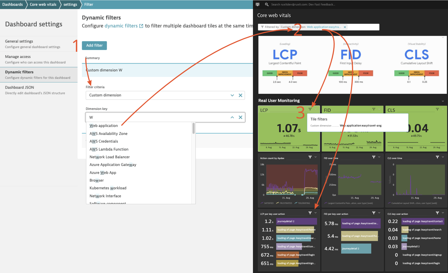
Dynamically filter your dashboard tiles by any desired dimension
Within Kubernetes, it’s very popular to use Prometheus to collect metrics from various technologies. Of course, Dynatrace can effortlessly integrate such metrics from Prometheus exporters and make them available for charting, alerting, and analysis. However, as metrics are exposed in the OpenMetrics format, dimensions can vary according to this standard. Therefore, a predefined list of dimensions for filtering doesn’t work very well. To give you the maximum flexibility in this and many other cases, we now allow you to dynamically filter your Data explorer tiles based on any dimension associated with metrics in those tiles. And, of course, there’s no need to manually configure your tiles to use your defined filters (and their dimensions) at the dashboard level because Dynatrace automatically associates them.
Use automatic entity relationship filters effortlessly in your tiles and dashboards via the topology
What if a metric you want to use doesn’t come with an important related entity dimension by which you want to filter it? With our recently added auto-extended filtering, you can easily filter by such dimensions without manually building filters for directly related entities!
In the Data explorer Build tab, we now automatically offer directly related entities out of the box so you can use them for filtering. We also consider such relationships in dashboards when you dynamically filter Data explorer tiles.
For example, you might want to filter your Synthetic step metric by a synthetic monitor containing the steps. To do so, now create a custom “Synthetic monitor” dimension filter on the dashboard; when filtering, Dynatrace automatically draws a connection between the two entities and filters your Synthetic step metric-based tiles by your selected monitor. Alternatively, what if I want to filter all my service key requests by a service with a specific tag? This is now possible, not just for a few special cases but generically and for all directly related entities in Dynatrace, thanks to the power of the topology and entity model.

Control the format of your numbers with a few clicks
Previously, Data explorer visualizations automatically applied number formats. We received a lot of feedback that users want to adjust the number format, so we’ve enabled greater flexibility in both the Build tab (UI mode) and the Code tab. You can now control the displayed unit as well as the number format.
- Adapt the unit: In case the automatically inferred unit from metric metadata doesn’t fit, you can now convert popular out-of-the-box units with a single click. For example, you can change the unit from MB to GB without performing conversions—we do it for you!
- Change the number format: Whether you want to apply auto-formatting, would like to see the raw, absolute numbers (for example, to highlight revenue, order, or booking numbers), or need more precision (for KPIs such as SLOs), the right number format is just a click away.
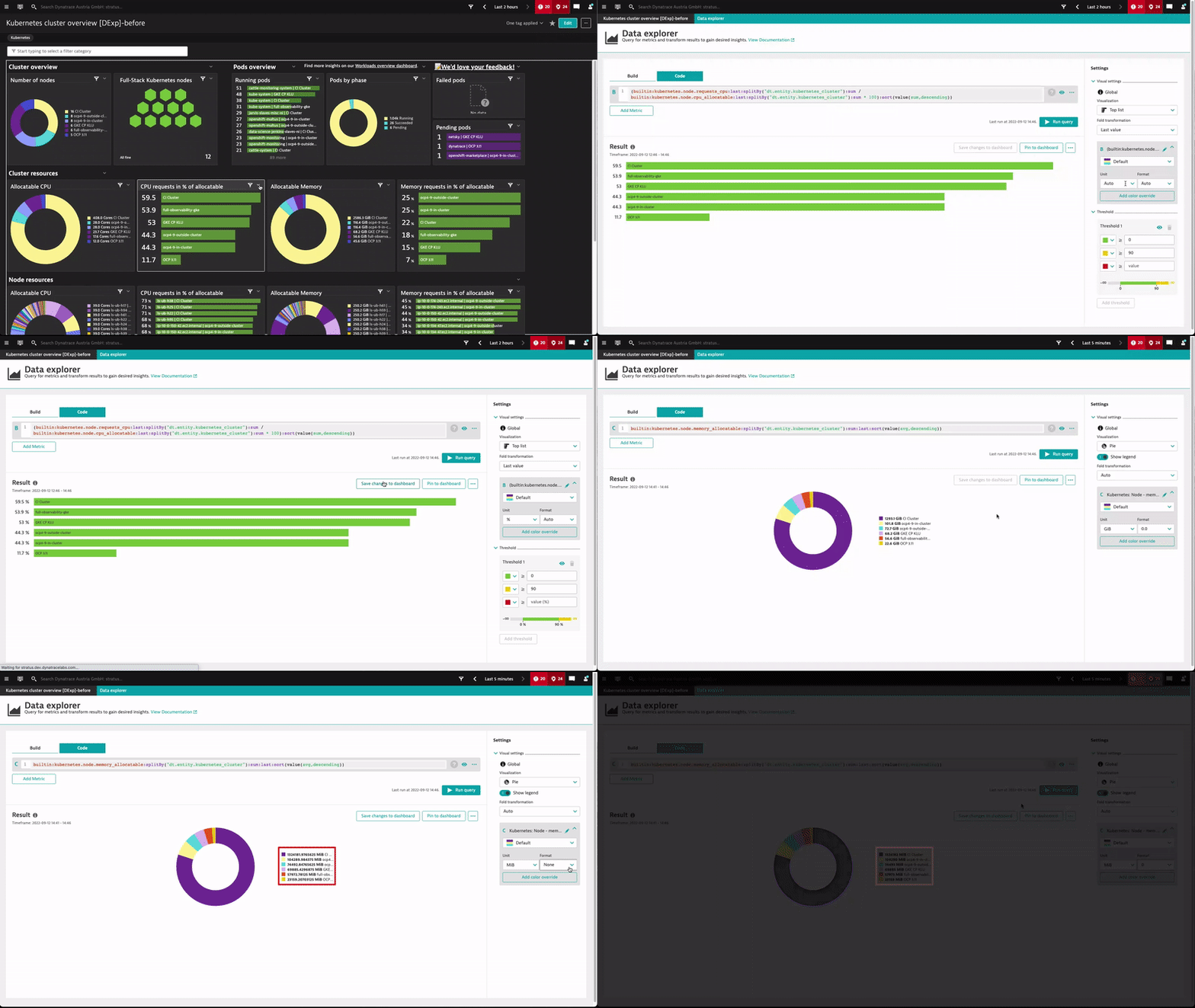
Here’s an example of controlling the number unit and format in our Kubernetes preset dashboards.

More color options for visualizations adapted to your CI needs
Data explorer visualizations have always offered various out-of-the-box color palettes. Your feedback, however, was that you needed additional means to color your dashboards to better fit your corporate identity or meet your visualization needs.
Therefore, we’ve overhauled dashboard color management and offer you more fine-grained settings.
- Override the color for an individual metric or series—whether you want to adjust charts to match your CI or want more visual distinctness than the default palette provides.
- Define custom threshold colors for more flexible conditional highlighting—you can now color the backgrounds of a single value or table cell to quickly identify the state of a distinct value.
- Leverage more colors in standard palettes—this is especially useful for displaying different error metrics by using an intuitive red color palette.
A good example of this in our Kubernetes preset dashboards is the use of color overrides to adapt the “Pods by phases” pie chart so that colors intuitively reflect the pod phases.

Visualize workloads over time and by type using stacked charts
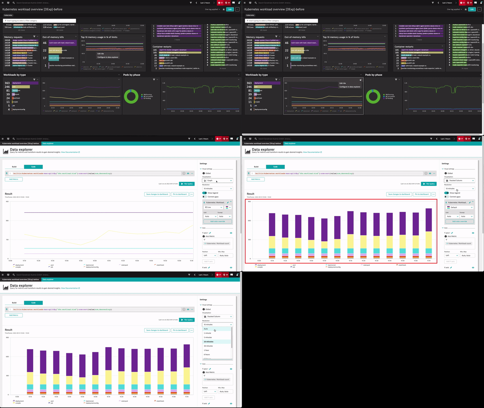
Stacked area and stacked column charts are now also available in the Data explorer. We haven’t just replicated old custom charting functionality; we’ve also added the ability to set the resolution of all graph-based charts so that you can set the required time granularity along the X axis.
Let’s look at how these changes helped us create and provide a more elegant workload breakdown by type for our Kubernetes environments.

What’s next
If you haven’t done so already, switch to the Data explorer!
All the enhanced features discussed in this blog post—auto-extended filtering via the topology, new chart types, and more customization options—have already been available with Dynatrace version 1.246. With the Data explorer and its upcoming refreshes, we envision a dashboarding solution that offers you not just the means to visualize and monitor your systems but one that also provides you rich context and interactivity: a solution that leverages the smartness of Davis while being simple and easy to use. So you can stop configuring and start analyzing!
With Dynatrace versions 1.251 and 1.252, we’ll provide you with more upgrade mechanisms (that is, upgrade by dashboard, upgrade in bulk via API, or filter to find your Custom chart-based dashboards easily) so that you can seamlessly migrate to the Data explorer by the time we phase out Custom chart functionality by Q2 2023. Review our documentation for all relevant details on upgrading and feature-support timelines.
One final note: We have good news if you liked the Kubernetes dashboard we used as an example in this blog post. Take a look at your list of preset dashboards—we’ll add a refreshed version of all Kubernetes preset dashboards to all version 1.251+ Dynatrace environments, so you can start analyzing and stop configuring.

If you’re currently using the Data explorer for dashboards and have any feedback or further questions, head to the Dynatrace Community and reach out to us.
If you’re new to Dynatrace, start your free trial today to see AIOps-enabled context and interactivity in action with the Data explorer and dashboards.


Looking for answers?
Start a new discussion or ask for help in our Q&A forum.
Go to forum