Dynatrace Dashboards are constantly updated with new capabilities. If you want to get up to speed, check out my recent Performance Clinics: “AI-Powered Dashboarding” and “Advanced Business Dashboarding and Analytics”.
A dashboard capability that was introduced not too long allows you to use Markdown, which is great for various things, such as:
- Providing links to other dashboards and resources.
- Providing textual information about the data on the dashboard.
- Including custom logos, headers, and special formatting.
Our customer at a top US-based insurance company had yet another story for me to share, explaining how his team is leveraging the Markdown capability at a large US-based insurance provider. It’s great that he keeps sharing these examples on how certain Dynatrace capabilities improve the day-to-day work of him and his colleagues.
#1: Who You Gonna Call?
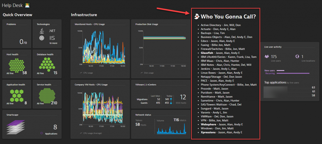
In the first email about the markdown usage, the customer told me this: “So a few weeks ago we rolled Dynatrace out to our Help Desk and second shift staff. With them having access to Dynatrace they could get an overview of our infrastructure as well as be alerted of issues as Dynatrace detects them. While I was giving my presentation to the staff a question kept coming up ‘How will this help me know who to call in the event of an issue?’ Dynatrace does a wonderful job getting that critical information out there but if a server support staff member is not interpreting it, that information can be difficult and of little value.
I thought about how we could assist those staff member with interpreting that information and reaching out to the right person. An excel sheet with services/process and such and who was responsible for them was already in existence but can get to be a pain to find and open it up, and hope that it was updated”
The customer came up with the perfect solution: Dynatrace Markup Tile!
They built a dashboard that contains the list of people and their responsibilities so that Help Desk staff members can easily find out whom to contact.

#2: Essential Information for Dynatrace Administrators
Another group of people within this company are the Dynatrace Administrators. They typically keep a list of important links, important contacts, blogs, etc. Instead of putting this somewhere on a wiki page, they decided to create a Dynatrace Dashboard that contains all of that essential information. Through Dynatrace permissions they can also control who has access to this data and who does not. The following shows this “Administrator Data” dashboard also featuring the links to the blogs that the customer was involved in writing over the last months. 😊

#3: What does it mean if the UFO is not green?
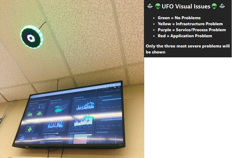
The customer has proudly deployed a couple of Dynatrace UFOs – flying around their offices – visualizing current quality state in their different environments. The UFOs are well received, but people sometimes keep asking: what does this color mean exactly?
To answer this question, the customer put the description on a Markdown on those dashboards they show on the mounted monitors next to the UFOs. Following shows the “flying” UFO and the markdown information:

Try it yourself!
As you can see – there are a lot of useful scenarios to leverage markdowns. Give it a try and feel free to share your examples.
I want to end the blog with a remark that the customer put in his last email to me. It said: Remember, keep your dashboards clean, simple, cool, and of course FUN! Don’t forget the Emojis!


Looking for answers?
Start a new discussion or ask for help in our Q&A forum.
Go to forum