Gen 3 monitoring is an approach to monitoring that is likely significantly different from what you may have been doing in the past. Dynatrace now automatically takes on many tasks that previously had to be performed manually:
- You no longer have to manually triage problems to find a root cause.
- You no longer have to look at chart trends to identify significant change points.
- You no longer have to guess if a problem actually impacts your business.
In the past, dashboards and charts helped to do all these things. Now, one might think that dashboards are less important as these tasks are now handled by Dynatrace AI. However, we continue to see strong demand for capable and flexible visualization tools. From a variety of opinions gathered over the past year, the following three themes seem to be present in most Gen 3 monitoring scenarios with Dynatrace.
#1 Building trust
Dynatrace does a number of amazing things. It tells you where problems occur and what causes them. It tells you which applications and even which exact users have been affected by a specific problem. All this sounds almost too good to be true. So it’s quite common and also perfectly reasonable that users want to build trust before fully committing to this AI-driven monitoring approach. In order to do this, users want to see key metric spikes of affected components in simple charts. Users want to be able to drill into those spikes and convince themselves that they are, in fact, looking at a problem’s root cause. The intrinsic desire to build trust is a primary reason why dashboards definitely still matter.
#2 Making things visible
Dynatrace gathers data—a lot of it. It’s actually almost impossible to grasp how much monitoring data the Dynatrace OneAgent really collects. As a user, I simply want to gain insight into the informational treasures that lie within my Dynatrace environment. Dashboards provide customizable facets to look at and understand the dynamics of gathered monitoring data.
#3 Reporting
Every enterprise has certain processes in place to organize and run their business. Wherever different departments or responsibilities interface, some sort of reporting usually occurs to communicate success or the lack of it. Dashboards are the only tool within Dynatrace for building custom visualizations, and we’re planning to invest further to support reporting use cases more conveniently.
Recent improvements
To deliver on users’ expectations, we continue to invest heavily in improving dashboarding and charting capabilities in Dynatrace. We’re happy to announce these three features have been added over the last few weeks.
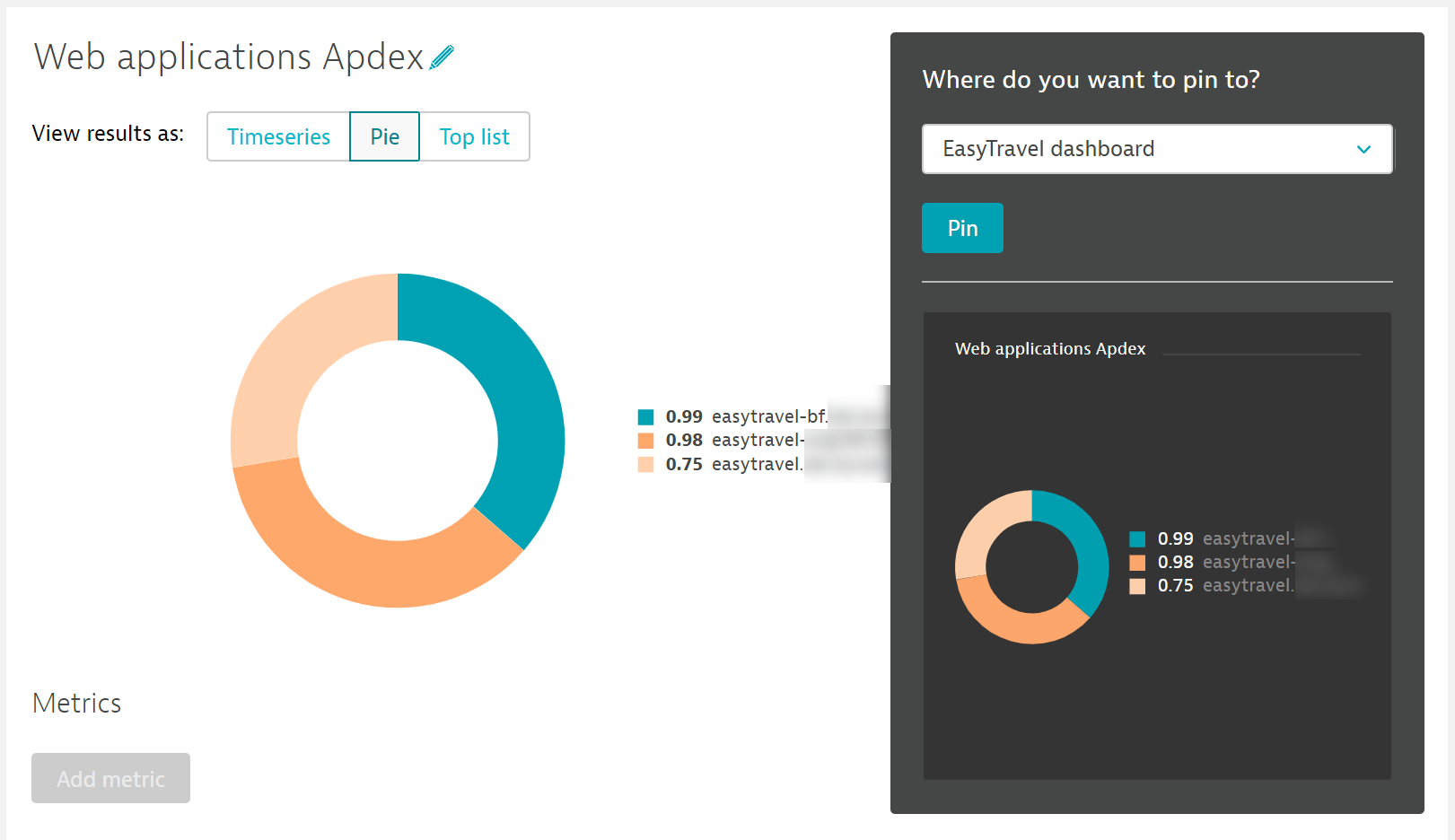
Pie charts
In addition to regular timeseries charts, Dynatrace now allows you to add pie charts to dashboards. The obvious advantage of pie charts in visualizing contribution ratios was a major reason why users have urged us to provide this feature.
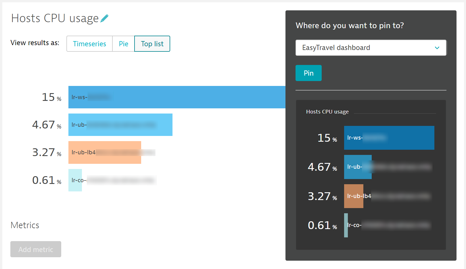
Top lists
Visualizing “Top x” entities associated with a metric is one of the most common use cases when building dashboards. Our top lists feature now offers targeted visualization for such scenarios. This chart type is particularly useful in combination with management zone filtering.
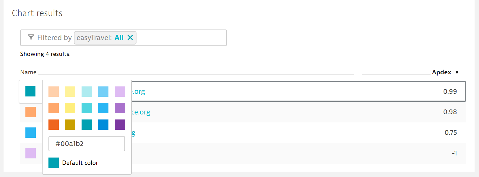
Custom colors
Many of the most prominent feature requests for custom charts revolved around the ability to assign custom colors. As a first improvement, we’ve added a color picker while we work on providing more flexible color defaults for differing use cases.
What’s next
Be sure to check out our forum post for additional planned enhancements for custom dashboards.
Here are some highlights that we plan to add to our charts in the near future:
- WYSIWYG dashboard editor
- Single-value visualization
- Markdown tile


Looking for answers?
Start a new discussion or ask for help in our Q&A forum.
Go to forum