Part of the secret sauce of Dynatrace is that it captures each transaction end-to-end. All requests within each transaction are tracked, beginning at the browser and extending through all services, all the way down to the code and database level. This approach to performance monitoring is reflected throughout Dynatrace, though it’s most prominent in service flow and service backtrace.
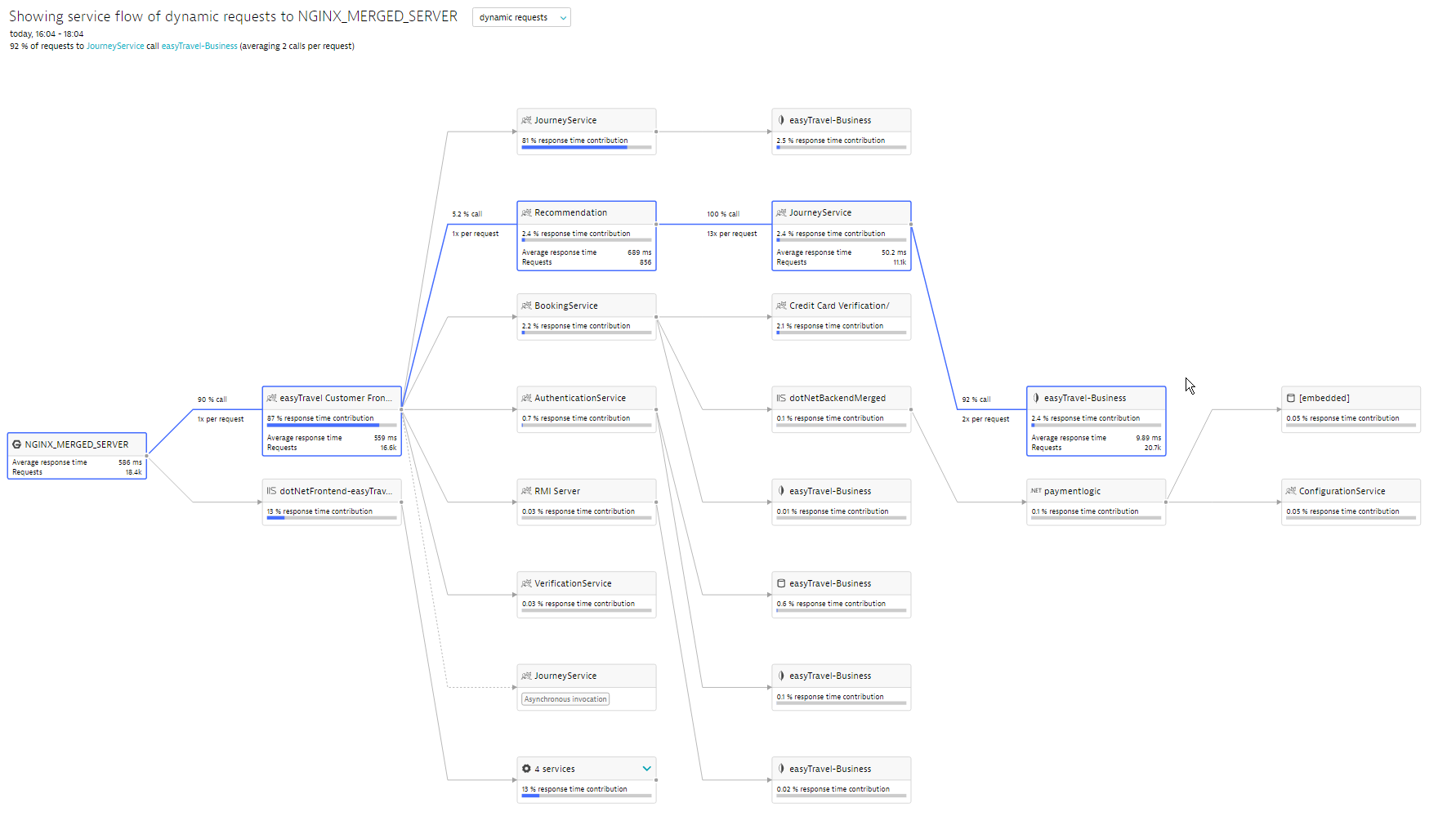
The service flow example below shows how a service’s requests flow through a system. As you can see, service flow doesn’t simply show you the requests that occurred at the point of the Nginx server call—each highlighted service in this specific service flow includes metric detail related to Average response time and number of Requests. This information is derived from our unique approach to end-to-end transaction tracing.
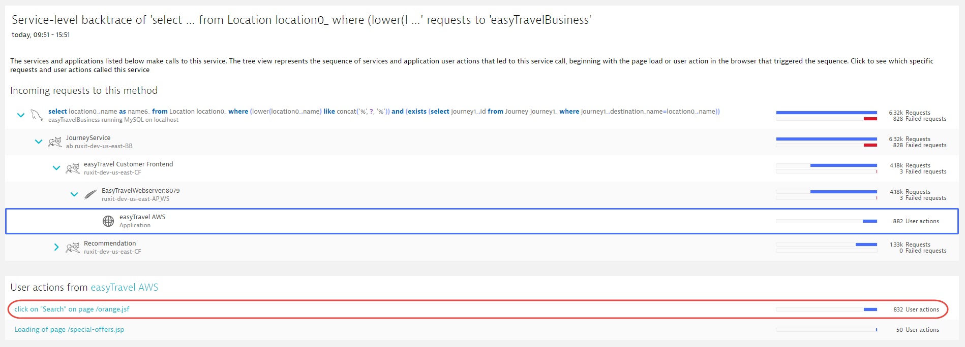
The completeness of transaction detail that Dynatrace captures is even more apparent when viewing the service backtrace of a single service request or SQL statement. The example below shows that the vast majority of the 6,000+ executions of this select statement originate from a web page click on a Search button.
And now, we’ve added another dimension to service analysis—Response time distribution.
Response time distribution (“outlier analysis”)
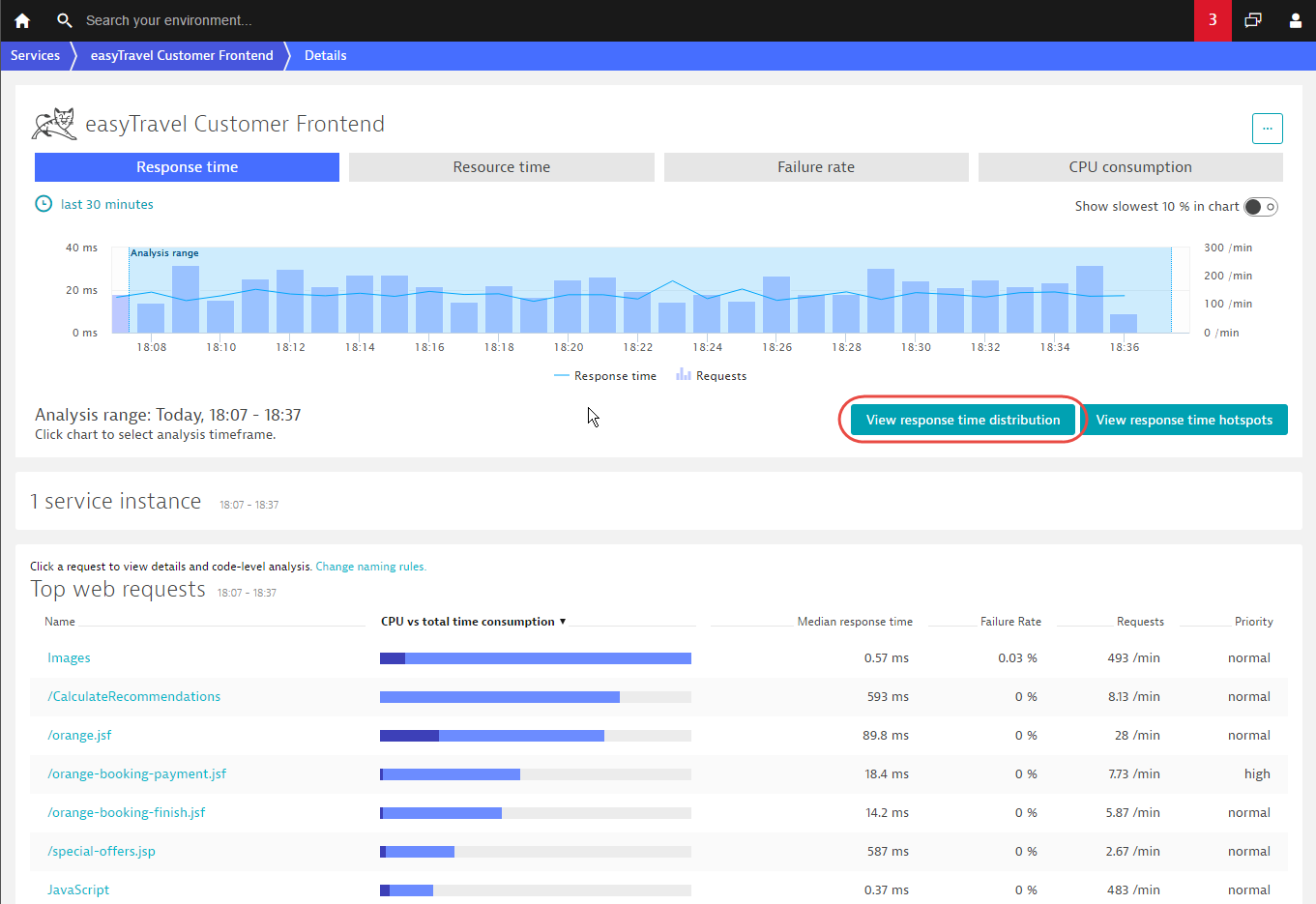
Dynatrace provides a Response time chart on each service and request Details page. Response time charts display the median and 90th percentiles, but much more detail is available by clicking the View response time distribution button.
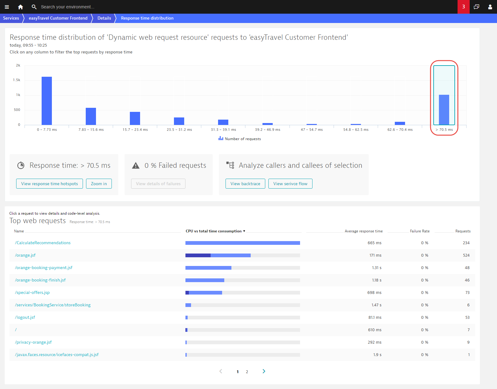
Requests commonly have widely disparate response time measurements. The new Response time distribution charts show you how response times are distributed during the selected time frame. You can see in the example below that, while several thousand requests are quite fast (the first three columns) there are over a thousand requests at the slow end of the spectrum (the last column).
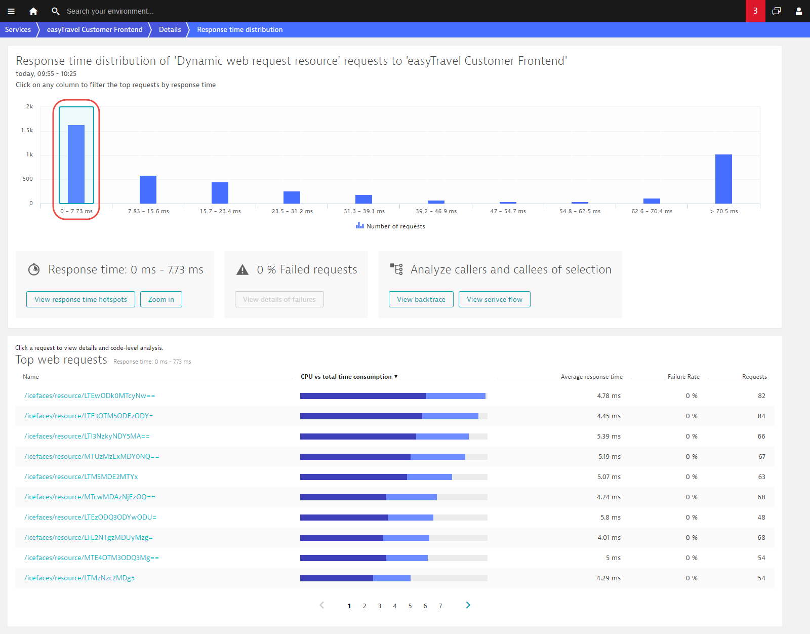
Click any column to see the specific request types that fall into that selected response time range. As you can see in the request table below, the fast requests are quite different from the slow requests on the other end of the spectrum. This is important to remember when analyzing the overall response time of a service.
You can take a closer look at the requests in this response time range by clicking the Zoom in button.
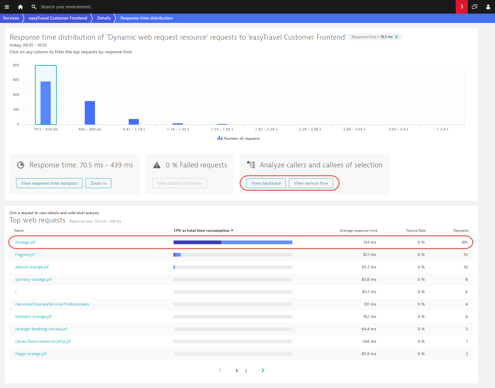
Now you can see that there are about 600 requests that have response times between 70.5 ms and 439 ms and that the orange.jsf web request contributes the most (491 requests during the analyzed time frame). You can now click View backtrace or View service flow to see how these requests fit within the overall transaction.
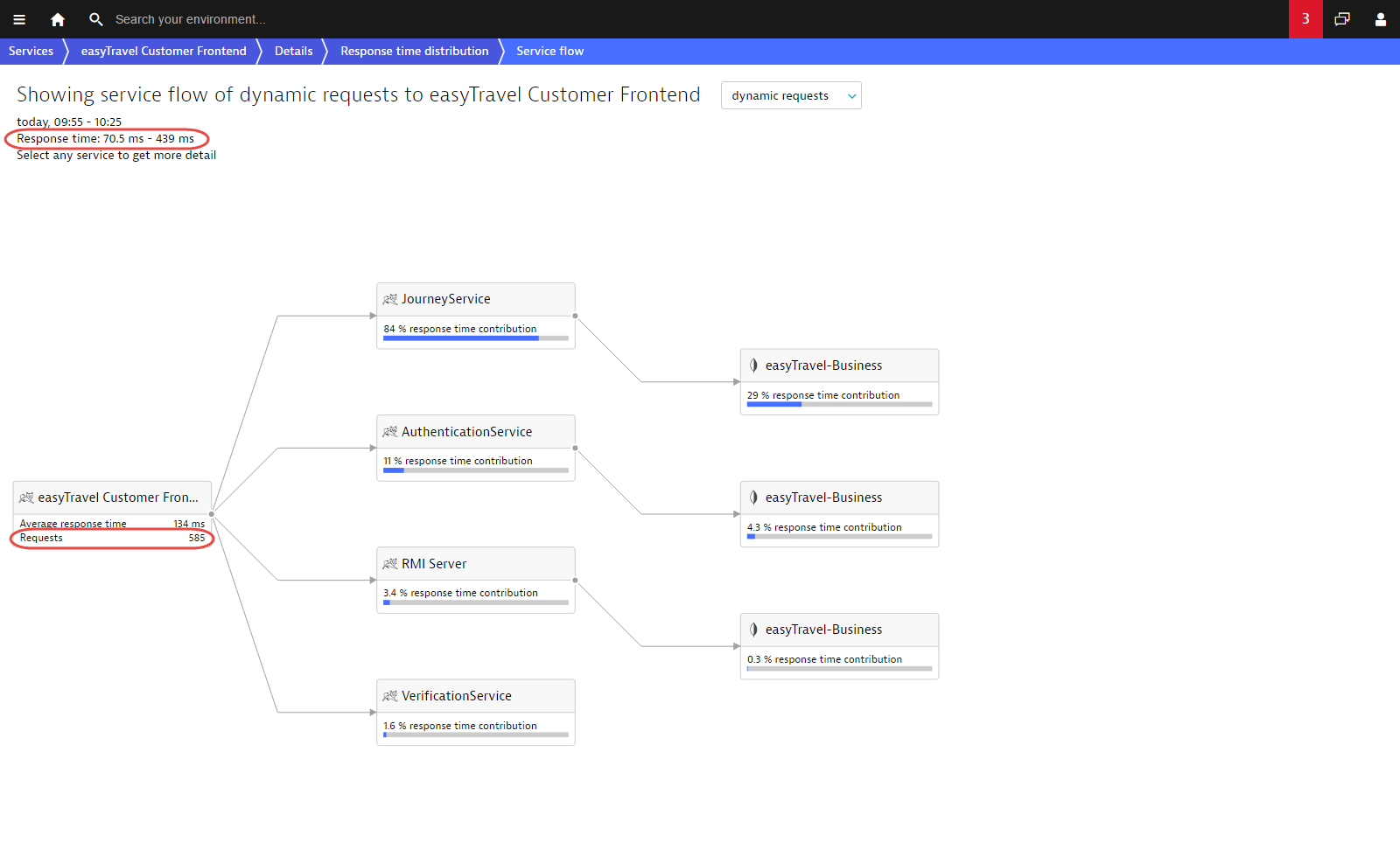
The Service flow example below shows the requests to the Customer Frontend service that have response times between 70 ms and 439 ms. The JourneyService contributes the most to the response time in this scenario. This Service flow depicts exactly 585 requests.
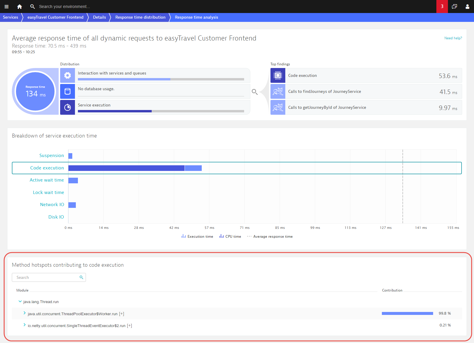
You can also click the View response time hotspots button to view in-depth detail related to the easyTravel Customer Frontend requests within this response time range. This gives you code level visibility into this range.
Analyze any slow request
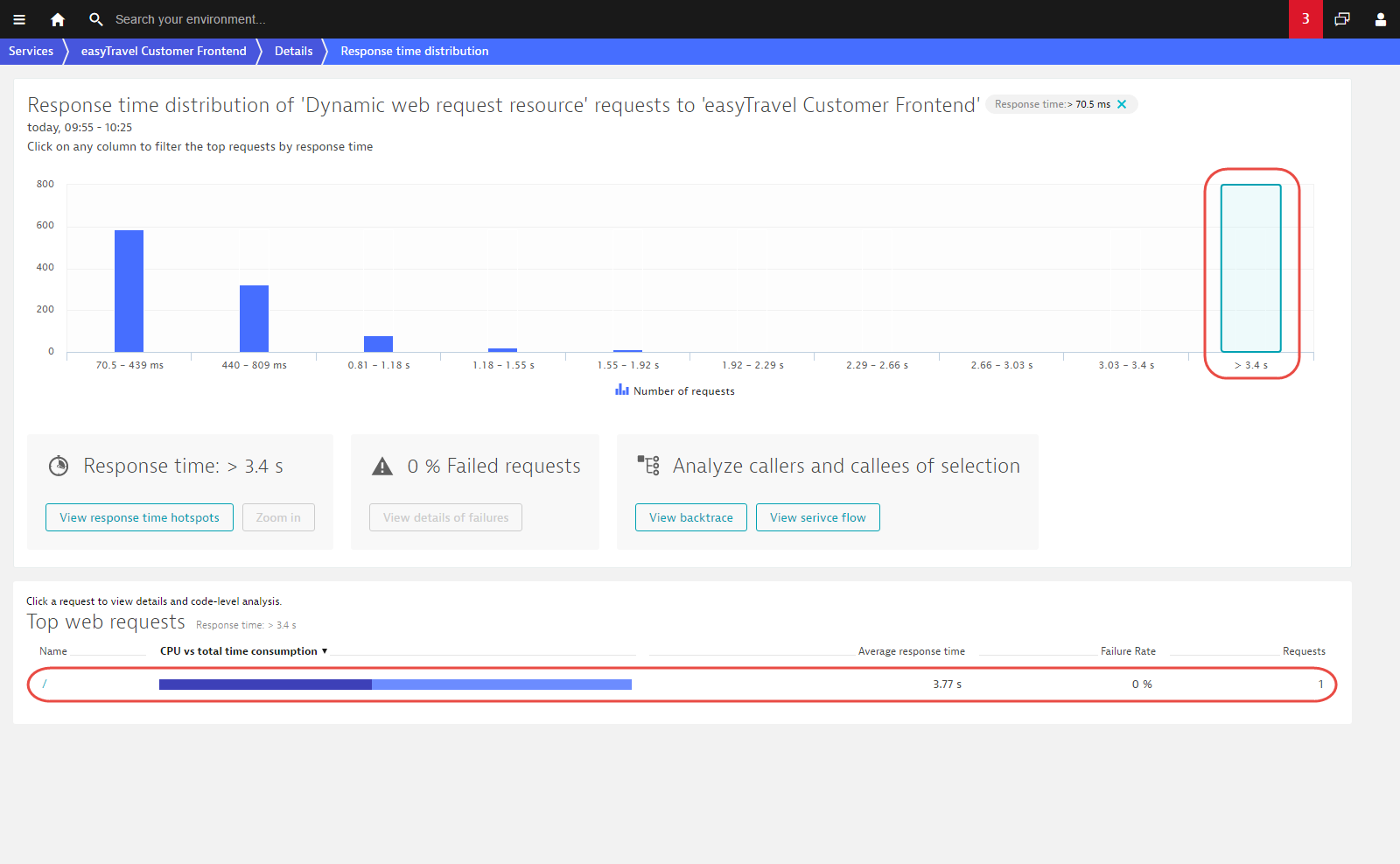
Returning to the Response time distribution chart, you can see that there are a few requests that have response times over 3.4 s. Clicking this column in the chart reveals further detail.
This last click has revealed a single request with a response time of 3.77 seconds (as seen in the table below). This means that only a single request behaved this way during the analysis time frame!
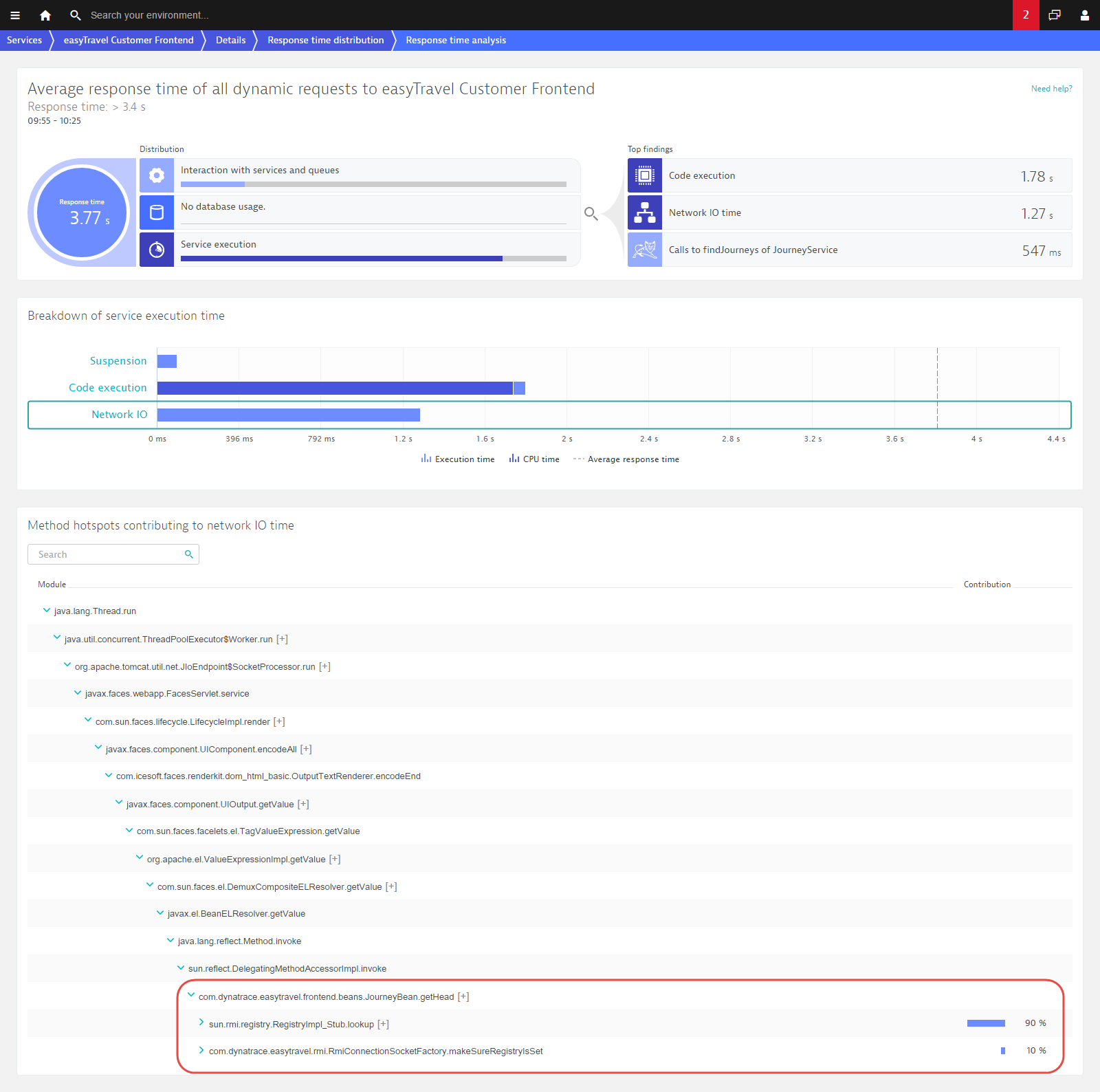
We can now look at the response time hotspot for this single request. This reveals that the reason for this outlier is an RMI lookup of the JourneyBean!
You can also have a look at the service flow for this request. Service flow shows this single transaction end-to-end and reveals that this single request has resulted in no less than 93 database calls!
As you can see, with only a few clicks, Dynatrace Dynatrace reveals valuable insights at the code detail level of each request.
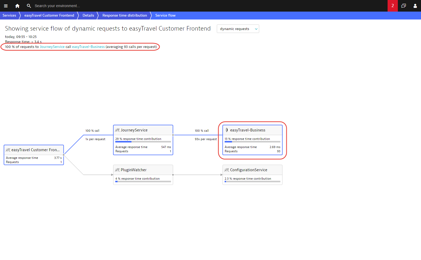
Additionally, if you compare this service flow example with the earlier example, you’ll see that these two requests are very different indeed.
Correlate errors with response times
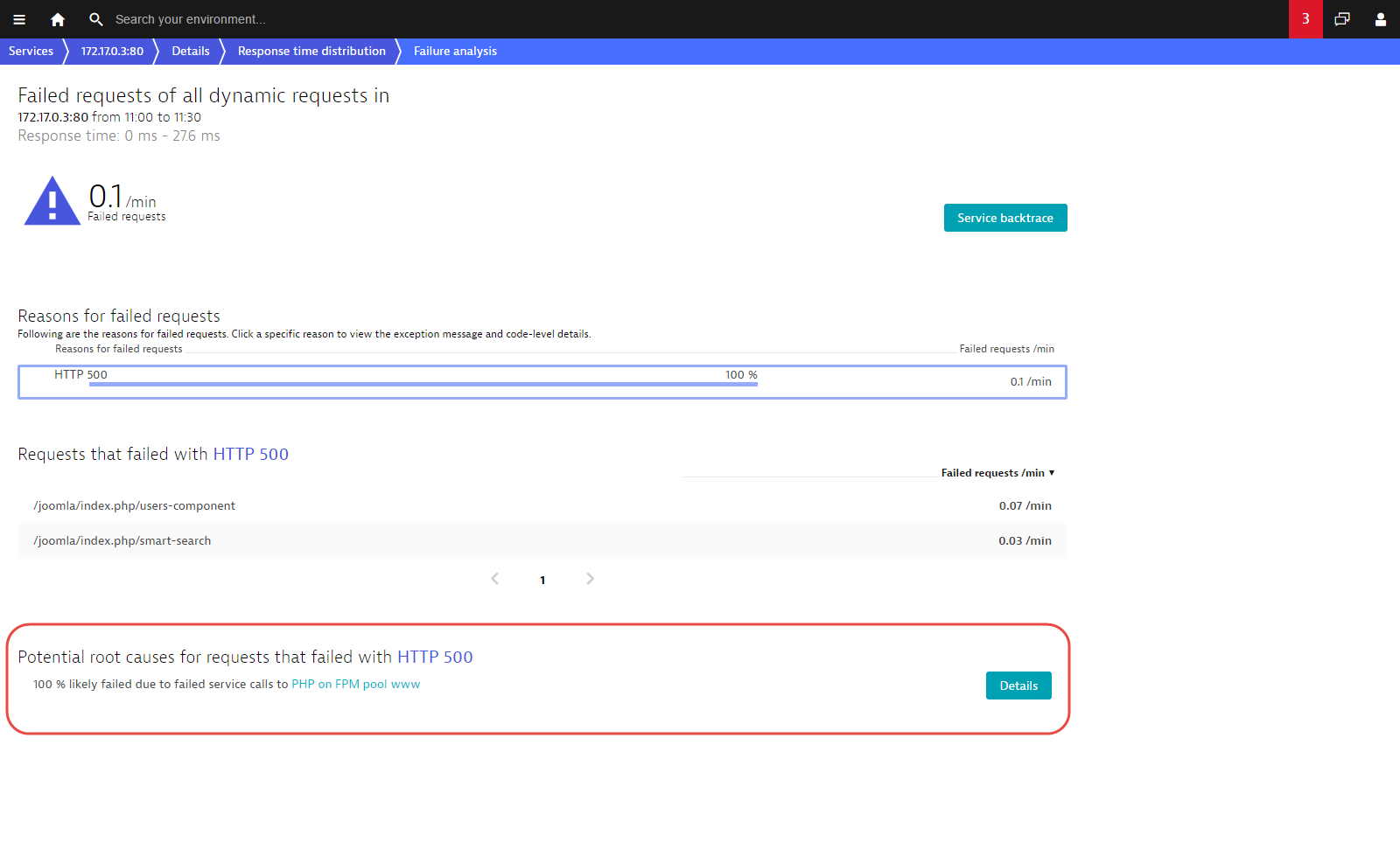
Another important aspect of Response time distribution is that it allows you to correlate failure rate with response time. Failing requests often have particularly fast or slow response times (they either fail quickly or eventually timeout). The example below shows that 38% of all requests faster than 27.6 ms are failing. A closer look at the request table reveals that these are actually two specific types of requests that always fail in this response time range. You can analyze this by clicking View details of failures.
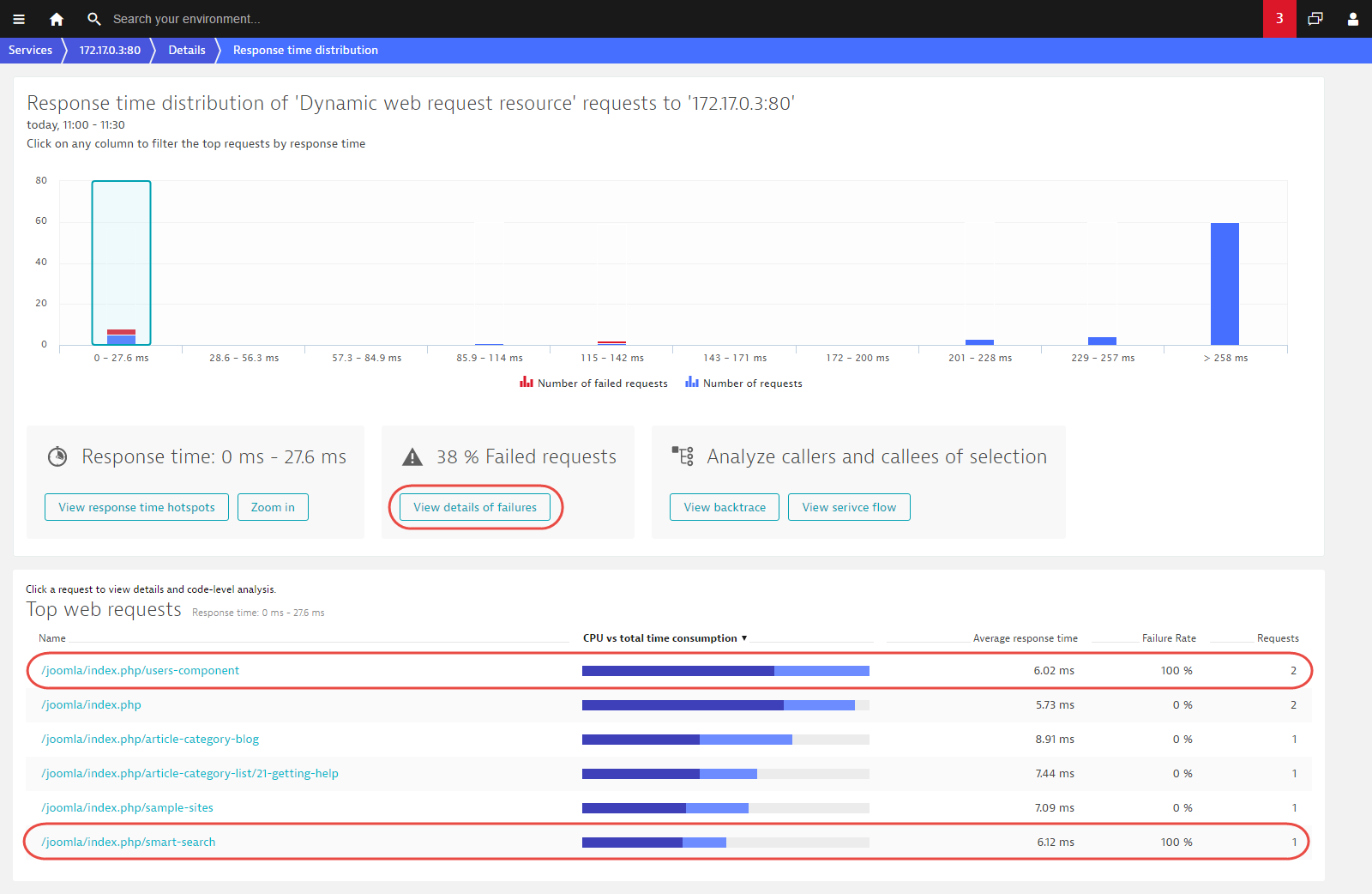
Failure analysis shows that the requests in question all fail due to an HTTP 500 error in the PHP on FPM pool www service, which can be further analyzed here by clicking the Details button.
As you can see, Response time distribution provides you with the power to look at outliers at either end of the response time spectrum. It reveals which types of requests contribute the most to your service’s overall response time and allows you to understand the correlation between errors and response time. And it enables you to harness the power underlying Dynatrace—the power to analyze every single request end-to-end.
As always however, there is more to come. So stay tuned.


Looking for answers?
Start a new discussion or ask for help in our Q&A forum.
Go to forum