Enhance your development workflow with the Amazon Q Developer CLI for Dynatrace MCP
Enhance your development workflow by integrating Amazon Q Developer CLI with the Dynatrace AI-powered observability platform using MCP.

Tutorials, tips and resources for engineers on cloud technologies and observability


Enhance your development workflow by integrating Amazon Q Developer CLI with the Dynatrace AI-powered observability platform using MCP.
Learn how to build agentic AI applications using the OpenAI Agents SDK and Azure AI Foundry with Dynatrace AI Observability built in.

Learn how Dynatrace empowers Site Reliability Engineers with end-to-end visibility and control, from code creation to live production.
AllObservabilityCloud nativeAIOpsOpen sourceApplication security

AI doesn’t replace, but amplifies developers. Those who’ll thrive in this new era aren’t the fastest typists — they’re the clearest thinkers.

Discover how Gemini CLI streamlines troubleshooting with Dynatrace MCP, enabling fast, agentic fixes for services.

React2Shell CVE-2025-55182 exposes servers to remote code execution. Learn risks, impacted frameworks, and urgent remediation steps.
Learn how integrated observability helps dev teams spot bugs early, boost code quality, and accelerate software delivery.
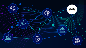
AWS publishes Dynatrace-developed blueprint for secure Amazon Bedrock access at scale

Learn how Dynatrace unifies synthetic monitoring, traces, and logs for instant insights.
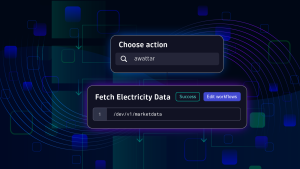
Equip teams to quickly craft custom apps and solutions on the Dynatrace platform.

Boost supply chain security with Dynatrace using real-time detection and automated workflows against malicious packages.

Learn how attackers exploiting CVE-2025-3248 can manipulate AI agent behavior and plant a malicious backdoor in AI-generated source code.

AI doesn’t replace, but amplifies developers. Those who’ll thrive in this new era aren’t the fastest typists — they’re the clearest thinkers.

Learn how integrated observability helps dev teams spot bugs early, boost code quality, and accelerate software delivery.

AWS publishes Dynatrace-developed blueprint for secure Amazon Bedrock access at scale

Sky-high developer productivity with Dynatrace MCP and GitHub Copilot

Enhance your development workflow by integrating Amazon Q Developer CLI with the Dynatrace AI-powered observability platform using MCP.

Learn how to build agentic AI applications using the OpenAI Agents SDK and Azure AI Foundry with Dynatrace AI Observability built in.
Learn how integrating Dynatrace with Azure Data Factory enables smarter, proactive management of data pipelines with automated insights and recovery.

Learn how to trigger Guardians whenever Amazon AWS EC2 tags change. Streamline AWS automation for better reliability and efficiency at scale.

Observability as Code: DIY with Crossplane

Learn about the Reliability metric, which measures modern operational practices.

Learn about all the things that can go wrong when moving to Kubernetes—and how to avoid the mistakes that lead to such problems.

Navigate the nuances between OpenShift and Kubernetes, understanding their strengths, use cases, and deployment considerations.

Stay ahead with visual, AI-powered forecasting, or get new insights into your data leveraging Davis CoPilot™.

This blog post delves into the relevance and utility of SLOs and how they might be helpful to you.
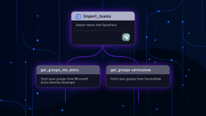
Learn a best practice approach for linking ownership information with observability data, enabling automation of incident triaging.
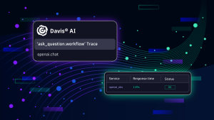
Dive into the world of AI model observability with Dynatrace and Traceloop OpenLLMetry, exploring insights, monitoring, and optimization.

Leverage Davis AI for Workflows to predict capacity needs, optimize resource allocation, and maintain peak performance.
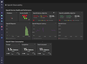
Explore reliable, cost-effective services powered by generative AI, ensuring optimal performance and scalability.

For observability watchers and cloud-native fans, KubeCon EU didn’t disappoint. Discover key takeaways and breakthrough Dynatrace sessions.

Easily experiment with the Astronomy Shop, the OpenTelemetry demo application, using Dynatrace as your full-context OTel backend.

Observability as Code: DIY with Crossplane

Dynatrace loves OpenTelemetry

Get started with Dynatrace support for OpenTelemetry: Learn how to send OpenTelemetry data to Dynatrace.

Solutions for common issues with OpenTelemetry Operator installation, deployment, and auto-instrumentation.

React2Shell CVE-2025-55182 exposes servers to remote code execution. Learn risks, impacted frameworks, and urgent remediation steps.

Boost supply chain security with Dynatrace using real-time detection and automated workflows against malicious packages.

Learn how attackers exploit Kubernetes container misconfigurations and how to defend against them with practical examples.

Here's how to use the newly published Snyk integration to create actionable Jira tickets.

Auth0 monitoring with Dynatrace enables organizations to gain unprecedented insights into authentication, security, and identity events.

This blog covers three building blocks of handling threats: Leave no gaps, get the right eyes on it, and respond quickly.