With the latest release of Dynatrace, we’ve introduced a new way to configure custom charts that makes dashboard creation easier and more intuitive. We’ve also introduced a valuable new type of dashboard tile called a “blinking light” tile.
Create custom charts
Custom charts enable you to analyze any combination of monitoring metrics directly on your dashboard.
To create a custom chart
- Select Create custom chart from the navigation menu.
Alternatively, you can select the Build custom chart tile in the Tile catalog.
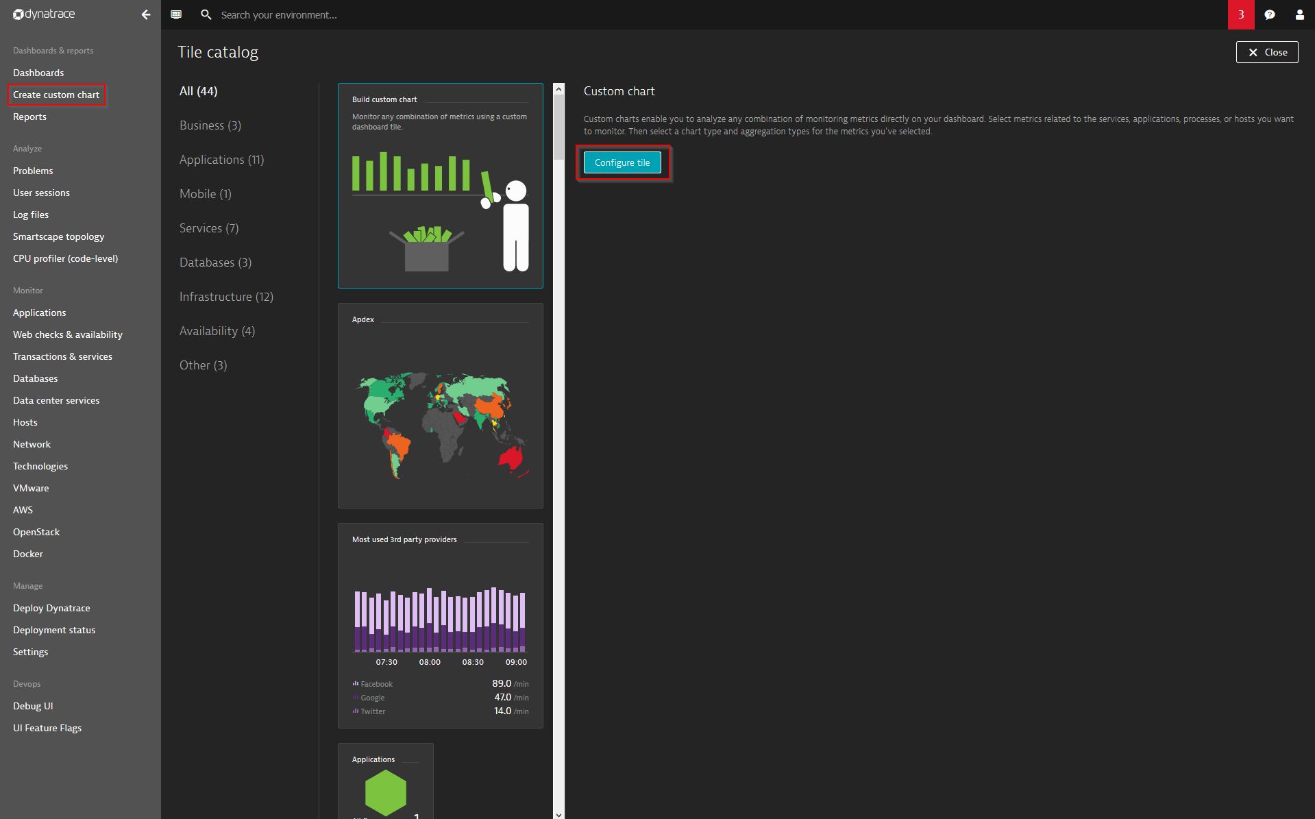
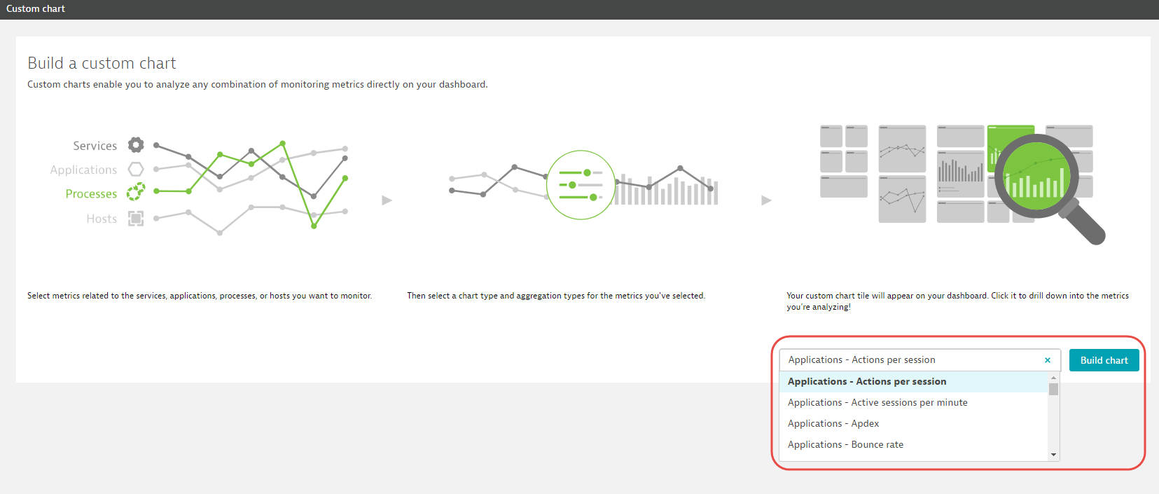
- On the Build a custom chart page, select metrics related to the services, applications, processes, or hosts you want to monitor.
For this example, we’ll select the metric Applications – Actions per session. - Click the Build chart button.
- Give your chart an intuitive name.
- Adjust the aggregation and display options for the metric you’ve selected. To do this, click the metric name, as shown below.
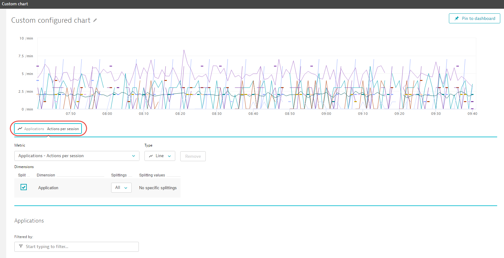
- Once you’ve configured the metric, you can optionally add additional metrics by clicking the Add metric button.
- Once you’re satisfied with your new chart, click the Pin to dashboard button to add the chart to your dashboard.
New filters and metrics
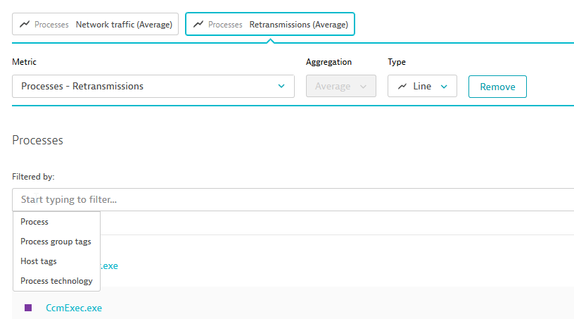
Filters make it easy to configure unique combinations of metric data for display on your custom dashboard charts. In the latest release of Dynatrace we enhanced the configuration of metrics and filters for custom charting. The following new metrics and filters are now available can now be added to your custom charts:
- Additional process filters
- VMware metrics and filters
- ESXi metrics and filters
The new metrics can be accessed via the metric drop list on the Build a custom chart page (see Step 3 above) or by clicking the Add metric button on the Custom chart page.
Note: You can still create workflow-related charts that focus on relevant subsets of the host-, service-, and database metrics in your environment. You can even combine custom metrics to create new charts that directly support your teams’ unique requirements. For full details, see Can I use filtering to create more sophisticated dashboard charts?
Blinking lights tiles
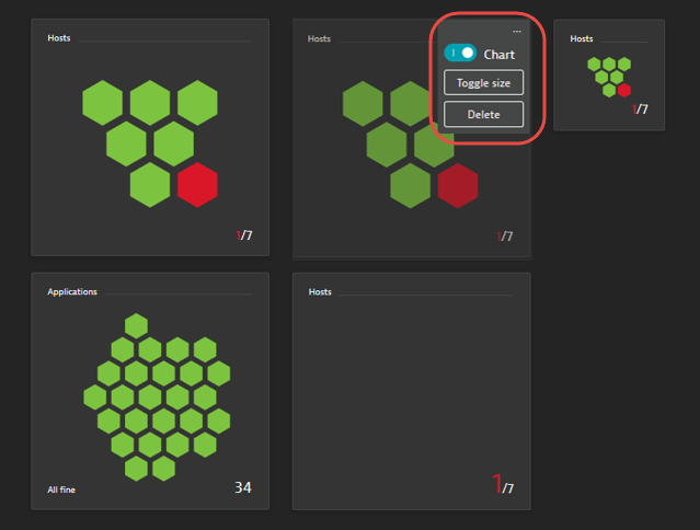
We’ve introduced a new type of dashboard tile (see examples below). Blinking light tiles enable you to see at a glance how many entities are affected by open problems. Blinking light dashboard tiles focus on a single entity type (e.g., hosts, applications, services, etc). Each green hexagon on a blinking light chart represents a healthy entity (i.e., an entity that is not associated with an open problem). Red hexagons represent entities that are affected by an open problem.
To add a blinking light tile to your dashboard
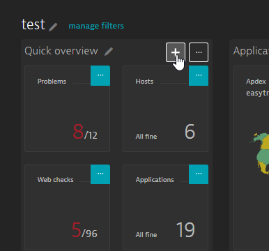
- From your home dashboard, click the Edit button to enter dashboard edit mode. Click the Add (+) button above the dashboard section within which you want the new tile to appear.
- Select the blinking light tile that’s dedicated to the entity type you want to monitor. Blinking light tiles are currently available for the following entity types: Hosts, Applications, Services, Data centers, Databases, and Web checks. Two different tile sizes are available. In the example below, the small Hosts tile is selected in the Infrastructure section of the tile catalog.
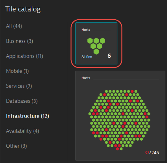
- Once pinned to your dashboard, you can click any blinking light tile to visit the corresponding entity list page and begin your analysis of any detected problems.
You can toggle the size of blinking light tiles by clicking the Toggle size switch available within each tile’s context menu. To retain a blinking light tile on your dashboard and disable the visualization, set the Chart switch to the Off position.



Looking for answers?
Start a new discussion or ask for help in our Q&A forum.
Go to forum